


December 8, 2023
Editorial Policy
All of our content is generated by subject matter experts with years of ad tech experience and structured by writers and educators for ease of use and digestibility. Learn more about our rigorous interview, content production and review process here.
Key Points
- The Layout Triad for Revenue: Master the art of website layout to balance user experience, SEO, and ad revenue. It's the digital juggling act that keeps visitors engaged and the cash register ringing.
- User Behavior Insights: Dive into user analytics like a digital detective. Use heat maps and session data to craft website layouts that lead users right where you want them — engaging with your content and ads.
- Spotlight on Viewability: It’s not just about having ads; it's about making them unmissable. Optimize ad placements to ensure they're seen and not just scrolled past, turning every view into potential revenue.
- Smart Ad Unit Revolution: Embrace AI-powered smart ad units. These high-tech heroes adapt to user preferences and site content, ensuring your ads are as effective and user-friendly as possible.
Hey there, money nerds! FinCon 2023 was the place to be for all things personal finance, and let me tell you, it was an electrifying experience. Imagine a carnival of financial wisdom — just less cotton candy and more calculators.
Playwire, even though it was our first time attending, jumped right into this financial fiesta not just to mingle but to add some spark.
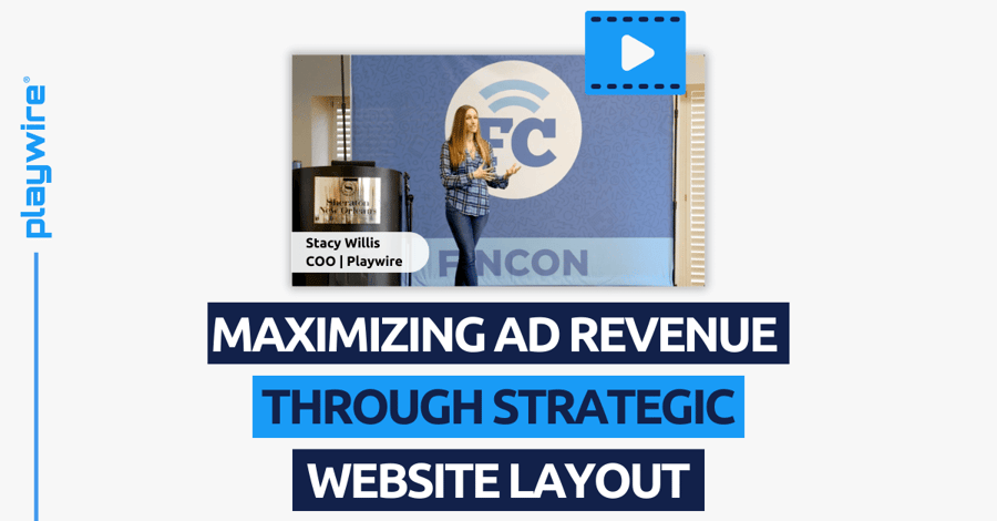
Our very own COO, Stacy Willis, took the stage, dropping knowledge bombs on optimizing website layouts for maximized ad revenue. If you were parked at home during this year’s event, don’t worry; we’ll bring you up to speed on Stacy’s talk.
While this talk was built for Personal Finance creators, there are valuable lessons here for creators of any type!
Click below to check out Stacy's full FinCon session or keep scrolling to review the highlights.
Balancing Revenue Factors
Stacy played the role of digital juggler, showing FinCon 2023 how to keep three balls in the air:
- User Experience: What visitors want from your site.
- SEO: Driving organic traffic to your site.
- Ads: Generating advertising revenue on your site.
She put the spotlight on layouts, which act as the ringmaster of the website circus. Get layouts right, and you’ve got a show that keeps everyone, from Google to real users, on the edge of their seats.
IMPACT OF LAYOUT ON REVENUE POTENTIAL
Your content and ad layout influence everything from the total sessions to the average duration of the visit. And, of course, the main event — ad impressions.
A well-planned layout means more eyeballs on your content and ads, which translates to the sweet sound of ch-ching. It’s the art of turning good traffic and engagement into a stellar performance that pays.
-- Article Continues Below --

Get custom ad layout recommendations based on your website type!
Analyzing User Experience
When it comes to website layouts, it’s like being a digital detective. Before you start moving things around, you have to know the why, the how, and the what of your users’ behavior.
Stacy pointed out heat map tools to see where users are clicking, scrolling, and lingering.
Like analyzing footprints in the sand, if you study metrics like pages per visit and average session length, you can start to piece together the average user path. From there, it’s all about testing different layouts to find that sweet spot that makes each page type a user-friendly battleground.
Viewability and Its Importance
Everyone in the digital advertising world is talking about viewability. It’s just about having ads; it’s about making sure they are in the user’s line of sight. For display ads, it’s like they have to be on stage, at 50% visibility, for a full second. Video ads? They need a two-second cameo.
Stacy’s tip: Place your ads where they’re most likely to be seen, not lost in the scroll. It’s almost like a digital game of chess — position your pieces (ads) in the right spot, and you’ll take the game.
Ad Formats Best Practices
Stacy took FinCon 2023 through a crash course on ad formats. She suggests using sticky ad units like bottom rails, side rails, and those nifty sticky sidebars. They’re your trusted sidekicks, always visible.
For the heavy lifting, bring in high-impact ad units — takeovers, flex leaderboards, the works.
And let’s not leave out standard IAB display ad sizes for broadcast reach. Combine all these in your digital utility belt, and you’re on your way toward ad format success.
Innovations in Ad Units
We’re now entering the era of smart ad units.
These aren’t just your average ads, oh no. They’re the tailored suit of the advertising world, custom-built for each user. Using advanced AI and analytics, these dynamic ads adapt based on user data, page content, and even the device they’re using.
With this advanced tech in your arsenal, you can ensure ads don’t step on each other’s toes but rather maximize viewability and sync up with the user journey.
It’s ad tech, but with a PhD in psychology.
Ready to Maximize Your Ad Revenue with Playwire?
So there you have it: the recap of all things Playwire at FinCon 2023. Of course, this is only a taste of Stacy’s expertise and insight. If you want the full package and more, Playwire is standing by. We’re your guru for all things layout, monetization, ad tech, and more. We’ll bring the tools, knowledge, and expertise; you bring the killer content.
Get in touch today to learn more about the Playwire difference.

Video Transcript
We're going to talk today about how to lay out your website and ads for maximum monetization. So what I wanted to start with is getting a little bit of information from around the room. How many of you guys are currently running ads on your website? Few. How many haven't started yet but are considering it? Okay, for those that are running ads, what kind of ad solution do you have? Just feel free to yell it out. So we have a managed service type of partner. Is anybody doing more of the DIY style with Google or anything like that? Okay, so for those of you that are a little bit ahead of the game, you're already starting to monetize, there's going to be some stuff in here where you may say, Hey, I know pieces of that, or it might reinforce some of the things you already know from your current provider.
We're also going to try and walk a line of saying, what do you need if you're on the DIY train versus if you are letting someone else handle it for you? So there's going to be a little bit for everyone. What I also say is if you guys have questions during the presentation, I don't like to be somebody that just blabs at you for 45 straight minutes, so feel free to raise your hand and let me know if you have a question. We'll make sure there's time for questions at the end. And then play wire is actually here in FinCon Central where Booth two 15. So if you find that you have questions after the fact, please come find me. I love to talk about this stuff. I'll talk your ear off about it for hours. So just be careful with what questions you ask, but don't hesitate.
So first and foremost, when we're talking about the idea of either partnering with an existing provider like a managed service or doing this yourself, in either case, it's very similar to this, sorry, very stock photo E version of a financial planner. If I'm coming and trying to improve my personal finances, it behooves me to at least understand what's going on beneath the surface to a degree. Even if I'm going to go with a managed service partner, it helps me to know the basics but then have them help me with execution. So that's what the focus of today is, is to help you guys understand what happens underneath, even if you do choose to go with a managed service partner. So first and foremost, we're going to go through and essentially we're going to cover today the key takeaways that'll come out of this. We'll go through each one and then at the end we'll kind of wrap up and allow you guys to ask questions on any of them.
But the first takeaway that we're going to talk about today is that ad revenue itself is very much a balancing act. It's not something that's simple, it's not something that's like pushing a button, turning it on, it's just a faucet. There's a lot more to consider than you may have thought, and I want you guys to all leave here with the knowledge that your layout is probably your greatest lever to control ad revenue. Everything else that you can pull, change, do, you're probably already doing, but your layout has the most ability to affect what you already have and turn that into the best amount of revenue. It's going to be really important during this process that you know your user experience inside, outside, upside down backwards every which direction. So if you don't, we're going to talk about some of the tools that can help you do that.
It's also going to be really important for everybody to understand the concept of viewability as you're thinking about how to lay out your ads. So this is a very ad tech nerdy topic that we could go on for about four hours. So we're going to try and condense it to the high-level things that are important to know without going way too in the weeds. It's really going to be important for you to walk away knowing about different ad formats, how they work, and where they work. And then lastly, we're going to talk about how you can use technology to help take away some of the pains of the learnings that are going to come out of this and all of the very many tiny little dials that you could choose to pick technology can solve a lot of that for you. So again, if you're thinking about partnering with an existing provider, you can then use that to evaluate the provider that you're looking at.
And so we're going to start today with our first takeaway and it's really the reality of ad revenue, that it's not simple. It's essentially looking at two sides of the same coin trying to get with my finance audience. So I used a coin analogy, but your website is the coin, right? On one side of that coin, it's meant to serve your audience. You want to bring people there, you want to give them great information, you want to provide them education. But on the other side of that coin, you want to make money from the people coming to your site. But the problem is those are two very opposing forces. What your audience wants from your website is probably the opposite of what an advertiser wants from your website in order to give you money to be placed on it. So your job is to sit at the middle of those two opposing forces and find that perfect center point or balance, but it's not even that simple because there's even more factors and this is kind of what you look like at the end of it.
There's SEO, how do I make sure I'm not losing traffic to my site, which is the lifeblood of my site today? There's user experience. So we've talked about what a user wants from your site. I want to make sure it's a really seamless user experience that they are happy, and then there's ads. I want to make money. So how do we make all of those factors, which by the way, if you increase or improve one of them, you're going to decrease or hurt one of the other ones. How do you make sure they can all coexist and hopefully you can start the day like this, but leave feeling like it's not this confusing anymore. That's my goal.
This is what we're going to walk out as. So if you're going to walk out understanding how you can balance like this guy here, I'm not going to try that. And really if you guys want to look at it in a better way that fits maybe your needs, it's the idea of balancing a checkbook. So you're going to walk out knowing exactly how you should have this all balanced and working so that you're not relying too heavily or pushing too heavily on one of those levers. We're going to introduce a new lever today. That's again, probably not something I have to explain very hard to a financial audience, but the idea of supply and demand is very present when you're thinking about ad revenue. So first of all, again, this is a give me for this audience, why is a diamond so valuable?
Feel free, shout 'em out. It's rare. It's rare. Yeah, so the way you're going to look at your ad revenue is really similar. So the typical graph you see right here with supply and demand, the way it applies to advertising is about the inventory on your site. So the less ads you have or the smaller the amount of inventory, the more value each individual unit would have because it's scarce. On the flip side of that, the more ads you throw on your site, the less value each individual unit will have because it's the very opposite. obs, scarce, plentiful, and somewhere in the middle you're going to find a perfect balance between the per unit price and the volume that you're selling. And so the terms that we use in advertising CPM along the Y axis, that's the per unit price of an ad times a thousand essentially, and fill rate is a measure of how much of your volume you're selling. And so this is one more thing you guys have to learn how to balance now in addition to all the things we've already talked about, and so you'll see how we come back to this concept frequently as we go through today's lesson.
Before we go too much farther, I figured it might be helpful for you to understand why the heck you should listen to me in the first place. You don't know me. Hopefully, by the end, you feel like you kind of do. I started my career in engineering. I was a nerd, a computer scientist. I went and I worked in engineering for a few years, loved problem-solving, loved all of the things that I got to do. I got really tired of sitting in a cubicle by myself and not talking to people. So I went back and I got my master's, expecting to go more into the business side. At the time I absolutely fell in love with marketing and what really surprised me is I fell in love with writing and that led me down a path of digital marketing. So I worked in the digital agency space for about 10 years and I was doing things like content production and SEO for a good chunk of those years.
So I'm a giant SEO nerd. If anybody wants to talk about SEO, feel free. I'll talk about that for hours as well. After that, I went to run the web design and development team at the agency I worked at. So I got really good at user experience design and after that, I actually started working for Play Wire as a marketer and I have since shifted into operations, but at the end of the day, all of these things I have a pretty long history of doing, which are all of the things content producers and content creators care about. So I have a very strong understanding of how to balance each of those pieces without overdoing one of them. So if you have questions about my background or anything else, feel free to let me expound on it at will, but I just figured you guys might care.
Why would I have to say it is at least somewhat useful? So let's dig into the next takeaway, which is why layout has the greatest ability to impact your revenue. So ad revenue is kind of a balance of these three things. You have the total number of sessions you could drive, you can think of that as the number of eyeballs you get to your site. You have session length, that's how long those eyeballs stay on your site and look at it. And then lastly, you have available ad impressions. So that's where you could choose to put ads in front of those eyeballs and how many you could choose to put in front of them. Essentially if you multiply all three of these together, that's how much revenue you have in terms of potential. And so you guys are probably already doing this, you guys probably know SEO pretty well or trying really hard to drive good traffic.
You're probably already thinking a good bit about how long you can keep a user on your site and how you can improve that length. What we can talk about today in terms of how layout can then take that to your next level is by thinking of the number of units I can put on my site and the value of each one of those units. So those are kind of the two sub-pieces to your available ad impressions and everything down at the bottom you can control with layout. The other two is up to you guys to figure out or I can talk to you about those after, but that's not what today's session's about. So at the end of the day, if you think about a grocery store, I can bring a lot of people in, so my total number of sessions and I can keep them walking around my grocery store for a very long time session length, but if all I have is crappy produce, is anybody going to buy it? So the other two don't matter if you have a crappy layout. So you want to have the pretty orange that people would like to buy because advertisers are people who buy things at the end of the day.
And so at the end of the day, layout is going to be your most important lever. If you have great session length, if you have a great number of sessions but you have a very bad layout, you're not going to make that much money. Let's make sure today we're leaving with a great idea of how to do that, which leads us into takeaway number three, which is that you need to understand your user experience really well before you can start to understand how to lay out your ads to maximize revenue. The fun part is that the user experience is not one size fits all. We like to think it is right, but your website's going to have a different experience than his website, than hers, than everybody's, right? So you want to think about how users use my website and there's a couple of things to think about.
Have you guys heard of the F tracking pattern? People who run websites on content producers probably know this. This is eye tracking. Essentially it's studies that they've looked at on how people's eyes track when they're looking at content on a screen. Most people are familiar with the F pattern. Most people think the F pattern is the only one that exists, but it's absolutely not. These are all the other different patterns that people use when looking at content on your website. A great example there, the layer cake pattern is why you want to make sure you have good subtitles in your blogs because you're going to get people who will skim look at the title and decide to read underneath it. So again, we want to make sure we're not thinking one size fits all, not even one size fits all across my own site on this type of page, my user might have an F pattern on this type of page.
My user might do the layer cake pattern. So each individual person might come with a different pattern and each individual page might foster a different pattern. And so we want to think that way when we're thinking about our layouts. Scroll behavior is another really important factor in how much ad revenue you can generate. So you guys, are you familiar with heatmap tools? Anybody? So the three that you see here, clarity by the way on top has a free version if you want to go try it. It's a tool that can help you understand how far users are scrolling down the page on your site and it looks like that graphic all the way on the other side. So the red is a lot of people saw this and the farther you get down to the green, the less people saw this. It's hot to cold.
If I put ads in the cold, is that going to help me too much? No. This is why it's very important to understand some things like squirrel behavior on your site and you can get really nerdy and data-driven with it if you want to use one of these tools. Another thing that's important to look at here are UX metrics. So I have a great website I can pop into GA and look at a couple of things to understand some of the pieces of the experience on that site that are going to really be impactful in my revenue generation capabilities. First is originally it was called session length in GA four. It's now called average engagement time. So this is how long someone spends engaged on your site. Total number of sessions is now engaged sessions per user. And so that's again, it's just some of the new wording in GA four if you're not familiar with it.
And that's telling me how many people are coming and actually engaging how many total sessions I have. And then pages per session is the old term. The new one is now engagement per session. This is a great understanding of how deep people are going into your content on your website. So I like using the old term because it's just a little bit easier to understand. Pages per session is the total number of pages I clicked through and looked at on your site in a single session. So all of these are really great metrics for understanding your user engagement and all of these are going to have an effect on your ability to generate ad revenue. So again, good ones to know and look at. An example of how this can help is if I have a total session length that is a minute longer than the person next to me, I can generate double the amount of revenue probably off of my site.
So it's really important to understand your own user experience metrics. This is a mistake we see really often when somebody is comparing their ad revenue to the person next to them. If the first question is, well yeah, users stay on my site twice as long, that's twice the number of ad impressions I can put in front of them. So again, super, super important to know. So at the end of the day before you jump in and think about where to put your ads on your site or if you should move them, you don't want to step back, get to understand your user, know your user, close your eyes and be your user. So it's really easy to just step back and look at your website as if you were a user and think about how people scroll or act on a specific page. Sometimes it's hard when we are the maker of the thing do that. So just a reminder.
So then let's jump into number four, which is understanding viewability. Is everybody here familiar with the concept of viewability? Is it new to you guys? Okay, so there's an old adage if a tree falls down in the forest, can anybody hear it? Ad viewability is somewhat the same. If I put an ad on a website and nobody sees it, can it make any money? An advertiser would say, heck no, I'm not paying for that. So this is how the concept of viewability came to be. Some very strict and specific definitions of what viewability means for a display ad, meaning a static ad on your site, it is that 50% of that ad unit's pixels are in view for at least one second or longer for a video ad it is that at least 50% of those videos pixels appear for a minimum of two seconds.
So slightly different definitions for display and for video, but super important. Did anybody know about that? One second or two second things? Yeah, so it is a little more complex than just somebody could see it or somebody could not see it. And then we're going to talk about why that matters a lot when you think about ad placement here in a bit. The next concept that is important to understand about viewability is the idea of small versus big. So that definition felt really small, right? We're talking about a very specific ad unit and ad placement, but your website also will get a summary viewability ranking based on the makeup of all the ad units on your site and how they perform. It's also going to be weighed more heavily on the units that are seen more So if you have the same ad layout on all of your article pages and your article pages, get the lion's share of your traffic, that's also going to be the biggest determinant in your total website viewability number.
So they all add up, but it's not an equivalent across the board. It's whichever ones are seen the most impacted the most. The end of the day you are a number to an advertiser and that number is your website viewability number, not the ad unit, viewability number, your website level. And so if your website viewability number is 42%, I'm going to judge you one way as an advertiser. If it's 70%, I'm going to judge you a lot differently. If I have a 70% chance on your website of getting an ad in front of a user's eyeballs, I'm going to be willing to pay a lot more for that than somebody whose website gives me a 40% chance of getting an ad in front of somebody's eyeballs, right? So huge, huge and important and understanding the value of the inventory across your site and how much somebody would be willing to pay for it.
And this is where things get really fun. We aren't balancing enough yet right now we get to play this game and think about how each individual ad unit and its placement results in changes to my total website viewability number. And this is where you get fun things like, hey, if I take out an ad unit that had really bad viewability, even though I'm taking an ad unit out, the rest of my ad units might go up in value and I might make more money total. So it's not always super easy to figure out. So some concepts to know before we step into layouts now is where we're going to start digging into some of the best practice layouts everybody should have on their seat or have gotten when they walked in a checklist. It's going to summarize pretty much everything we talk about here. So if you want to take notes on that sheet, feel free. If you want to take notes on your own, you're also welcome to do that. I'm a note taker, but I also wanted to make sure you guys could walk away with something that you didn't have to sit and take a billion notes on.
We're going to start with some best practices for ad locations. And so first and foremost, how many have seen this placement before? Top of the page leaderboard is pretty common. Yeah, we're going to talk about that in a second. But first of all, we're going to talk about navigational elements and the idea of accidental clicks.
So if I put this ad unit too close to my nav bar, people are going to accidentally click on it. It happens all the time. I'm trying to click around on your navigation, I miss, I click the ad. If Google or someone else upstream in the ad tech ecosystem has decided that you're getting a lot of accidental clicks, they will dock the heck out of you and they will say, you're not real, you're fake clicking. My advertisers don't like to pay for clicks that aren't real, so they will stop spending. Or in some cases they actually do this thing called two click, where they actually make users click a second time on your ad in order to get through. So you want to keep things away from navigational elements to avoid accidental clicks for the same reason. You want to make sure there's plenty of padding around your ad units from content next to it, especially clickable content. Again, these are both designed to say let's stay away from accidental clicks. Nobody likes those. They get us into trouble. And now let's talk about this standard top of the page leaderboard placement. It's standard but god knows why it's terrible. We want to move this down. So remember how we talked about viewability and that definition includes at least one second of in view time to be considered viewable. If I'm a user, do I care about seeing that ad? What's the first thing I'm going to do?
I'm going to scroll down and I'm probably going to do it before that ad was sitting there for a whole second, which means I just had an ad with 0% viewability. So these guys are sneaky ways that your total site viewability will be getting dragged down because these guys are going to drag you down on viewability. These ones are often that case where you can say, Hey, I might actually just remove that ad unit and my total revenue could go up. As counterintuitive as it could seem, it's really going to depend on your users, your experience, but this is a common one that we say to move it down as low as you can on the page but above the fold. Even if you still want to keep it, it's totally fine, just don't put it right at the top and then people have long enough to scroll past it while still keeping it on the screen for at least one second. So that's a big one to get rid of. The other thing to think about, and this actually kind of brings us back to our accidental click philosophy, mobile is a little bit of a different animal and when you guys are thinking about ad layouts, you should definitely be thinking separately about your desktop or laptop experience and your mobile experience because they're very different.
Scrolling on a mobile device is a little less differentiable from clicking on a mobile device. You still have to tap the screen and move it up, right? If you put an ad in a spot where people naturally tap to scroll, it will accidentally get clicked all the time. So you're going to put yourself in accidental click territory. So make sure when your page first loads on screen where your ads show up, and if you're in a spot where people naturally, which is usually if you're looking at this, the middle third of the screen and slightly down is where people usually naturally put their thumb or their finger depending on if you're a thumb or finger scroller. I'm a finger scroller personally, but you just want to make sure it's not right where they're going to put it to scroll. Now, just to remind us, walking away from ad location best practices, we want to keep away from navigational elements, use plenty of padding, avoid the top of the page leaderboard trap and pay attention to mobile placement. All those are on that sheet as a reminder from here, let's talk about some of the best practices when it comes to ad placement and how it interacts with user experience.
Yeah, I hope I look like a human and not a sloth, but this is wishful thinking. Expectation management is very important. A lot of times we look at our user experience and say, how can we make it perfect when we might not actually have to. Satisfaction is actually more correlated with expectation than anything else. So if I expect a terrible user experience and you give me an okay one, I'm actually more satisfied than if I expected an incredible experience and got a pretty decent one because you took me down from my expectations rather than up. So you just want to find a happy medium. Users expect to see ads. It is natural, it is normal for them. It's not weird. As long as you are not putting them in weird or unexpected places and you're still giving them a great experience, you can really still fully exceed expectations. Even with ads on the page, it's important to think about satisfaction in this light, not necessarily like best or worst. Ad clutter is very important. So on mobile you want to make sure this is the coalition for better ad standards that no more than 30% of your page height is taken up with ads and you're set. You're not ad cluttered on a mobile device. That's pretty simple.
Desktop laptop screens. On the other hand, it's a little bit more like the Supreme Court Justice who said when defining pornography, I can't tell you what it is, but I'll tell you when I see it. Desktop ad clutters like that, there's no such standard. It's really hard to say what clutter is and what isn't. But when you go to a website that's really cluttered with ads, do you tell? Yeah, so there's a few best practices to keep in mind to avoid clutter, and one of those is mixing high-impact units with display. So standard display units earn less than high-impact units because they're less flashy, they're less exciting. And so if you throw a boatload of standard display units on your page, you're going to start to get cluttered where you could have that and utilize really high-impact units in scarcity to get more revenue. So it's just finding that mix is going to be really helpful. Picking the best position for display units. So like we just talked about, if I want to limit the total number of display units on my page, I want to pick the spots that are going to be the best performing because I'm going to have fewer and then you're going to follow all the rest of the best practices you'll find on that sheet and it will help you very safely avoid the idea of ad clutter.
And lastly, when you're thinking about user experience, we talked about how one size does not fit all you want to get in a test and measure philosophy here. There's a concept in mathematics called gradient ascent. We have money nerds here, so you guys might actually be familiar with this. It might be the first time I've presented this that people would know what gradient ascent means. But the idea is if I'm looking at a mountain range from the ground, I may not be able to see the highest peak from the ground. There might be things in my way, but if I begin to climb towards the highest peak that I can currently see, I can stop looking around again and reassess when I get to higher ground and say, oh, there's my new tallest, now I'm going to aim that way and keep going up. Eventually, you're going to reach the highest peak from that philosophy. So you want to treat user experience like that. As you're adding ads, look at your user experience metrics, make sure nothing has changed. Great, maybe I can try another ad. And so always test and measure, test and measure.
So just quickly to review, you want to make sure you're exceeding expectations, avoiding ad clutter, test, measure test and again and again, rinse, repeat forever and ever and ever because you're never at the top right. There's always a reason to get better. Sorry about that. Now we're going to talk about, yeah, do you have a question? Oh, you bet you want a picture? No problem, of course. Let's talk through the best practices for ad unit use. Now we're going to get into specific ad units. You should be able to find either in a managed service, a DIY situation, anything. These are pretty standard. The first recommendation I have is to use sticky ad units. If you're not use them, they're wonderful. They stay in view always because they're stuck to the screen. So some great sticky units are rail units. So I think everybody's probably pretty familiar with the bottom rail. It's pretty standard. I don't know if you've seen left or right rails. The graphic here shows on the left side of the screen. Sometimes they will stay flush all the way side to side of the screen. Sometimes they can live in the gutter a little bit away from the side, but rails are wonderful and great, but you want to make sure you have really smart technology for these because if that screen size is smaller, am I going to have space for it?
Nope. So you want to make sure that the technology that delivers units like this understands screen size and content width and can choose, do I put it there or not? I don't want to invade the content space. You can use units that are sticky when it counts. So units like what we see in this sidebar stick for a portion of time, they don't start sticky, but they then dock and stay sticky as a user scrolls. So if they understand the user's current viewport, they can decide what to do and when to stick. So another important factor for video ads, a great placement is that corner docked position that you see here. Again, relatively standard. If you guys are new to ads or haven't run them yet, this is going to be your beastly revenue producer. It's going to be huge. You want, again, someone that you can work with. If you're working with a managed service provider that understands how big to make those, because the bigger they are, the more they invade the user experience. And really the fun part is small, tiny wins like this make just as much revenue. They don't have to be big.
You want to incorporate high impact units into your experience. So these are some of the units that we kind of touched on before when we talked about incorporating high impact with the standard display to make sure you have that good mix. These are the guys that are going to generate ridiculous amounts of money per unit. So these are the diamonds. You have concepts like a flex leaderboard where it stays sticky to the top of the screen and then as the user begins to scroll, it shrinks so it stays out of their way but stays in view the entire time for their session. This is an idea of something like a site takeover, which is usually what it's called industry wide. This is our example at play wire. We call it a flex skin because it incorporates that flex leaderboard we showed on the other side as well as a site skin in the gutters. If you're A-I-M-D-B user, they're a great example. They do these all the time. Advertisers will pay very, very high dollar for these. Sometimes $25 A CPM pre-con video is another one. You can usually put this in front of either if you host video content on your site or if you host a tool, a calculator, maybe we have a lot of finance sites in here or even a game gating that by putting a pre-con video ad in front of it. This is a big, nice viewable screen for a video ad and advertisers will pay a lot of money for those.
Interstitials are another one that can be a huge revenue driver. This one is definitely one that feels like it's a philosophy tester for a lot of publishers. Some people are not comfortable with this experience. So the idea of an interstitial is that sometimes when I switch pages between my site, I make an ad that pops up, IX out and I continue on with my experience. It's really just a measure of what your level of comfortability is. I always suggest testing it out, and watch your user experience metrics. If you see a drop in pages per session when doing this, you can then make an informed decision about if it's right for your site or not and you just keep the frequency low. Usually you are pretty safe with having a frequency of once every 10 minutes during a user session for something like this because it's really rare that a user session lasts longer than 10 minutes, so you're only going to give them one at max in a session. These are the standard IAB sizes I was talking about. So they're standard for a reason. Everybody uses them, which means they are the largest volume of ads out there. So if you're not serving these sizes, you're probably missing out on a decent amount of volume. These are small, they don't generate a ton per unit, but there'll be workhorses in the fact that they can give you a lot of existing demand that is out there.
And so these are the sizes. I'm happy to give everybody these slides. They're also, these sizes are listed on your sheet. So as a reminder, we want to use sticky ad units, boost our performance with those rails. We talked about incorporating interactive units where possible or high impact and making sure we're utilizing those standard IAB sizes for display. So again, all those are on your best practices list if you want to reference it back. And now we're going to talk about how all of these things interplay with viewability.
So when we're choosing ad units, I'm going to list them out and you guys are going to tell me that I'm being really repetitive because everything we just talked about in terms of revenue generation comes back to being a really good revenue generator because it's really good for viewability. So we're going to use adhesive or sticky units. We're going to use a bottom rail. We're going to use left and right rails. We're going to use our flex leaderboards and we're going to use a sticky sidebar. So again, all of the things that we just talked about because they're good at revenue generation, are good at revenue generation because they're good for viewability.
There's a few settings that usually your technology will take care of that also relate to viewability that you guys should at least be aware of. So the idea of lazy loading means I choose not to load or call an ad until I know a user is going to scroll it into view. This one's tough and can be a little bit fuzzy because it's really about the likelihood that the ad will be scrolled into view. If you wait until it's all the way in view, then you have a pause before the ad can load and may not have a full one second before the user scrolls it back out of view. So you want to play this game of probabilities. Again, probably not a concept into this group, but what's the likelihood that an ad unit's going to get scrolled into view? And that's when I choose to call it refreshing in view versus out of view. So once a user scrolls an ad out of view, you stop refreshing it. It's kind of a simple concept. No in front of the eyes of a user. The idea of refresh might be new. It's not something we've talked about today. Standard refresh timing is once every 30 seconds. That's what the IAB calls for. So basically once an ad unit's been in front of my eyes for 30 seconds, I can actually replace it with a new one.
Typically the farther you go down in refresh count, the less interest an advertiser will have in paying for that slot because they know five ads just showed before them. Total number of refreshes because of that concept we just talked about, you might actually have a point at which your number of refreshes, it doesn't make sense to keep going, no longer making enough money to be worth the effort. Once I get to 10 refreshes, sometimes it's like, okay, that's time to stop. I'm good. And then refresh triggers is another concept you can choose to refresh when a user does some level of interaction with the page that changes the layout. Again, tools or calculators are a great example of this. When somebody finishes a calculation, you can choose to use that as a trigger to refresh an ad as well because it shows the user is currently right there looking at the page, doing something on it. So it's pretty valuable to an advertiser. So we're going to do a couple of quick examples. This one we've already talked about. So if this is the top of the page and that's where the fold is, everybody understands the concept of the fold.
Okay, what do we want to do with that ad unit?
We want to move it down as simple as that. We just don't want it at the very top below the fold units. So say the fold is here, we've scrolled down the opposite is true. You want to keep those as high as you can underneath the fold. Again, going to increase the likelihood that it's going to be scrolled into view. So you want to find a way to get as close up to that fold as possible if you have bottom of the fold units or below the fold units, and you might get to a point where you're too far down the page and remember that scroll picture, we looked at that you're all the way in the blue and those ad units are never viewable and they're not really doing anything for you. You may choose to remove them. So occasionally that will happen.
The concept of scrollable containers. If you're using a managed service provider, a lot of them do this. So this might not be a formal concept to you. The light blue container outside of the dark blue in that center area is what we call a viewable container. Says a couple things. First of all, you'll notice that when I hit the top I dock and stay within that container and then move past it. It allows you to serve more sizes. So this gets you more available inventory that you can allow to compete against each other. So I could put a taller ad than that one in there and it still wouldn't cause any problems. It wouldn't cause my layout to move my content to shift. And that's where we have CLS content layout shift is an important factor in Google's ranking. So you want to make sure you're not doing it and it improves view abilities fast. So if I'm scrolling quickly that increases the likelihood, then I might stay in view for a full second because it docks temporarily and stays in my screen longer.
So sidebar units, you're going to see that same container that we just talked about, but then you're also going to see when we get to the last one, it's going to dock and stay sticky down the rest of the page. You just want to make sure your layering units fit content and whatever your current sidebar content is, you want to make sure it fits length. One other thing I will note here, if you don't have a sidebar, adding one is great before you add ads because it gives you more opportunities for ads. Make that last one sticky. Oops. And then you might go to this next one, which is a more advanced one, which is what we call stacked sticky sidebar units. So this takes that bottom one, and this is a semi janky screen recording where you can see we have one unit come in, replace the other, and then stay sticky and in view. So this just increases your in view ad opportunity and uses that unused space on the right side of your screen that's not being used for anything else. So why not have it generate me some money?
And so this gives you great viewability, more in view opportunities and you don't lose out on that valuable real estate. So this is kind of like the next level.
So when we get down to the next section, I'm going to talk about how your tech can help you. And when we do that, we'll talk about how we use user behavior to determine some of those things. The answer is there are best practices with how the tech chooses to load a unit and when they choose to do it and when somebody's most likely to click is that it's no one size fits all answer. I'm sorry that that's the answer, but it is. And we'll talk about some strategies to get around that here shortly. You're welcome. And so you guys are welcome if you have questions. The handouts on the chairs have all of this in a nice checklist for you guys. So let's take this moment to shift to our final takeaway, which is to let technology help you. So this one's real fun.
We're going to remind ourselves that each interaction is unique. So everything we talked about with user experience before, even all those cool tools we talked about, they do one thing that I don't like. It's kind of by design. You don't have a choice. They average out your user experience. So when I look at a scroll map, I'm looking at the average of every user that scrolled on that page and how far they scrolled. That's not that great. I want to know, hey, that user scrolled all the way down but that one didn't. So it's taking knowledge that even at the user by user or session by session level, each interaction is going to be unique. We don't want to cater to the average if we don't have to, we will if that's all we know, which historically that it has been all we've known, but we're going to talk about how you can get rid of that notion.
So having ad units that know about the device, this one is pretty standard. I bet most of you guys are familiar with the idea that an ad unit can do something different on a mobile device than a desktop device. But a great example of that is our video player. We choose a different default size on desktop and mobile because it takes up a very different amount of page real estate. So you want a smaller video player on mobile for instance. So making sure your ad units are doing what makes sense for a mobile experience and a desktop experience. You want ad units that know about the experience. So remember that rail unit we talked about at the beginning and we talked about how your technology has to be smart, it should know exactly how big the viewport is and exactly how big your content width is. And then it'll say if I don't have enough space to fit this ad that's come in and ask me to be placed here, I won't put it there. So on a small screen, that ad won't be there on a big screen. That ad will be there.
Add units that know about the individual user and their behavior. So if I scroll really fast but he scrolls really slow, I would want to actually inject ad units at different frequencies because if you inject a lot of ads and to me the fast scroller, I'm going to feel like your whole website is freaking ads. But if you take a nice slow scroller, the one unit will come on the page at a time, he won't feel overwhelmed, there will not be a ton of ads. So I want to take into account his behavior versus my behavior and serve him a different ad experience. So in-content is a great example of this. You can choose to inject those at different frequencies or they will automatically inject at the right places based on a user's scroll behavior
Ad units that know about each other. So not only do I know about the world around me, I know about all the other ad units on page and what they're doing. So if we look at this sticky one here at the bottom that's pointing to after we get to the bottom one, I could also choose to serve a skyscraper that's that tall one. But depending on my screen size, I might be behind the video player if I do that. And I don't want anything in front of my ads because advertisers don't like that. So I'm going to choose to only take and call the smaller unit depending on my screen size and depending on what's happening down there with my video player. So it's actually ad units that understand and are creating an entire page experience.
And then lastly, ad units that will interact with each other. So a great example is this skin. Did you notice that some of the other ad units went away when that skin came on? They would be in the way, right? If I had a rail something else, it's going to be overlapping my unit. So it actually says don't serve a rail unit if I have one of these to serve because this one's worth a lot more money to me. So when they actually can interact with each other and tell each other not to do something or not to show up, it makes the whole experience better for the user. So we're now thinking at a page level, each page experience as a whole. We're not thinking about each individual ad unit because if we do, we end up with places where we run into each other. If I'm just thinking ad unit by ad unit, I'm going to leave a rail on top of this skin and an advertiser is going to say, no, no, my skin is not viewable, I'm not going to pay you for that. So we just want to make sure that everything is aware of each other. We want things to be smart.
With that, I know we've had a lot of hyper-specific conversations about individual units and what's good and what's bad. I want to leave you guys with some standardized suggested layouts of great combinations that should work really well for the majority of cases today. Keep in mind no website, there's no one size fits all answer. So these are great starting points. I would not consider them ending points for yourself or for anyone else. It's what you can start with. And then test small changes from there. We're going to go, we're going to talk about a couple different pages, page types. Scrolling pages are pages where the expected user experience is for them to scroll down through content. So you'll see the first three screens are examples of what look like listing pages. So if you run a blog, it's like your blog listing page, it's your homepage typically. And then the two on the right are long form content pages. So articles usually. And so the same ad layout tends to work well for both of these because the experience is similar on both of these.
We're going to talk from good to better to best. The idea being that within that spectrum you're always going to be in a place where you're controlling ad clutter. We're not going to suggest anything that would ever put you into the ad clutter bucket. You can then play with what makes sense for you and your site and what your comfortability is with introducing ads. If you're brand new, you might want to start on the lower end of the spectrum and introduce slowly and so you can see incrementally how each one changes and affects your experience and your revenue. So that's the spectrum we have. I'm going to start at the low end. This is for good. So good, better and best. None of them are bad. You see the combination we have here is a bottom rail, a corner duck video player, a single sticky unit in your sidebar. And then what we called our in contents before. Some places refer to them as in articles they should automatically inject if you can based on the user scroll speed, user scroll behavior. Better is we layer some additional ads up into our sidebar. So you can see now there's two ads in our sidebar, otherwise nothing's changed. So oftentimes what we recommend from a website layout perspective is if you don't have content in your sidebar, but you have really long articles, add some content in your sidebar like hey, recommended content related content, popular content. And then you can layer ads in between them. So it's still not like just add, add, add, add, add. There's still some interesting content for the user but allows you to layer in more ads. And then best is to use that very smart rail over on the left side. One other thing I will note, if you do not have a sidebar and you do not want to create one because it's work, you can also substitute a right rail above the video player instead because it'll create a similar sidebar experience. It'll just keep the ad docked to the side of the screen. You would not want to do that with a sidebar because then you're getting into ad clutter territory that makes sense?
And then always try to incorporate high impact units when possible. The nice thing about high impact units like this, well you can think about it as nice or not nice depending on your perspective. Usually these are not sold programmatically or what we'd say. Like I'm not an advertiser that goes into Google Ad Manager and builds a campaign and can serve these kinds of things because it's rare that a website can serve them. They're usually pretty specialized and customized. If you work with an ad management provider, sometimes they will have access to these high impact units, but it usually requires that they have a direct sales team because they're usually directly sold to advertisers who would like to make a splash. We do a lot of these with Hulu and Netflix when they have a movie coming out. We see a lot of gaming publishers when they're releasing a new game want to do big splashy experiences like this. So
The other one I wanted to talk about with this group, because some of your websites may have calculators or tools for your audiences, the user experience on a calculator or tool, occasionally also a game if anybody has financial games, it's possible is that a user actually sits and stares at a single point on the screen for an extended period of time. They're not expected to scroll through content to get to it. So your ad experience will necessarily have to be different than what we just talked about. You want to use up the margins as much as you can around that thing the user is focused on while they're there. So this is an example of a good layout that doesn't have too many ads on it. We have a bottom rail, we have an ad in the sidebar next to whatever the piece of content is. And then you see the blue video player in the center is if you wanted to do something we talked about with the high impact units, that pre-con unit where you actually gate your tool if it's valuable enough behind a video ad, watch a 32nd ad and then you can play it with my calculator and get all of the answers to your problems depending on if you have the space for it. So this one is where we now can kind of bring that top of page leaderboard back. If I don't have to scroll to see the bottom of that calculator, I'm not going to scroll. I'm going to go ahead and leave that leaderboard right there on the screen. So you might be able to do it. You'll test it carefully though and you're going to measure it and then you'll take it off if it's actually hurting your viewability.
And then lastly, you can incorporate, this is an example of that right rail and video player together. This is that case where your units need to understand and know about each other. I shouldn't serve a tall one. If my screen is shorter than that, it'll overlap a video player. You also have the ability to say, I want a corner docked video player that I'm just going to leave in the corner out on top of whatever my calculator or tool is. It's not going to obstruct it so that the user can play with that. But there's video ads showing in the corner video ads, by the way, in case you didn't know six times higher CPMs typically than display in case of your experience, your wallet will like it. And so I'm just going to quickly go back through and summarize some of our key takeaways to make sure we all have them.
Ad revenue is, if nothing else, a balancing act layout is your greatest tool to impact revenue. Absent being able to change magically overnight the number of users you have coming to your website or how long they're willing to stay, it's very important before you think about your ad layout that you know your user experience well, it's very important that you understand the concept of viewability and how that's going to impact your ability to generate revenue. You should know about available ad formats and how they work. This one is kind of tough because they're changing constantly. So stay on top of it, I would say. And if you do work with a managed service provider, they'll tell you all about the ad units they have and they definitely won't tell you about the ad units they don't have. So go keep an eye out in the industry on what other websites are doing, what other providers offer, things like that.
You'll find a lot of ad management providers won't have a lot of those high impact formats, for instance, because they usually don't have direct sales teams, which means they don't have an ability to connect those advertisers to the websites that want to run those. And then lastly, this one is probably the most important of all of those things that we said ad units need to understand. They should understand the individual user experience, they should understand the device they're on. They should understand the page size. They should understand how the other units on the page are behaving. Use that to evaluate your managed service provider. Can their technology do those things? Can you inject ads at a different frequency because I'm scrolling faster than somebody else?
And lastly, I have a lot longer on this. If anybody wants, we have a full course on our website. It also comes with a template where you can actually go through and define all the changes you want to make to your own layout. It has this checklist, and then one more on top of it. It does go a little bit deeper into those refresh behaviors we talked about and some of the individual ad call settings that are really highly technical in case you want to dig into those a little bit more and see how those impact viewability. And lastly, if you are looking for any kind of support, we are running a promotion right now specifically just for attendees to this, which is if you currently run ads and would like to try us, I know it's a very, very big risk in Q4 to say, I'm going to change ad providers.
We want to just help take the risk out of that. If you'd like to try us, you can have 60 days at 20% guaranteed higher revenue than what you make now. You just have to show us what you make now, and that way it gives you two months to decide if we're the right fit and then feel free to leave if we're not. So the offer's out there. The last thing I'll say is, you can find me at booth 215, and I will gladly go through your website and tell you what to change about your ad unit. Specifically, if you want to bring your website over, we'll pull up my laptop, we'll pull up a mobile device, and I will go through it with you as detailed as you want. That is my job. That's what I do every day. So I love talking about it. I will be mean, but at least you will have answers.
Great, and are there any other questions that I can answer?
Google Ad Manager provides a viewability score if you use that, if you do it DIY, depending on your managed service provider, they usually can at least give you that information if they are managing your ads. In Google Ad Manager, it is what we would call the publisher side of the tool stack. There's also an advertiser side of the tech stack. So when advertisers run ads, they actually run a tool called Moat to check viewability, and that's what they consider their source of truth and they will pull you off of campaigns if you go below their threshold. So there's two tools to look at.
Second question, yeah. Video ads, if they're corner docked, you never want audio enabled. Very occasionally a mislabeled creative will come through and it'll happen. It should be rare. It's not like the end of the world if it happens every once in a while, but by standard it should be muted. If you go with pre-con where you actually have it in either before a game, a tool or a video that plays, you are allowed to play unmuted, and that's why advertisers pay a lot more for those.
So yeah, the question was on sidebar ads, do you move them to the bottom on mobile? Each website actually treats their sidebar differently on mobile. Some websites just completely remove their sidebar on mobile. Some of them move it to the bottom, like you discussed. We usually just don't serve sidebar ads at all because they're so low on the page, they're not really going to generate you anything on a mobile device. We usually only serve them on desktop.
On mobile, I would still test, right? Do a measure test. If you've got great scrollers on mobile, they may still be generating you some revenue. So I would then just turn them off, see how much it changes things, and then decide. Any other questions?
I will add one more thing, just because we were talking about tests pre and post tests in ad tech are hard. So I'm not sure if everybody's really familiar with seasonality patterns in ad buying, but typically quarter one is the worst quarter of the year. Nobody's buying stuff in January because they just bought a bunch of stuff in December. It is really weird. Ads are just Christmas presents, but Q4 is the highest. That's when advertisers are spending the most on ads, and it usually kind of creates this saw tooth pattern throughout the year where at the beginning of every quarter it's down by the end of the quarter it's higher. There's even seasonality patterns within the month and week and sometimes even the hour. So when you're doing pre and post-test, sometimes it's really hard to account for seasonality. If I had two weeks with one layout and two weeks with another layout, but the two weeks with the second layout was when advertisers are paying more, it might not be the greatest comparison. So if you have a tool that allows you to do a 50/50 test where you're actually testing two layouts or two different things at the same time, it helps account for some of that seasonality.
Around election years and advertising, it's really a case by case basis. If a website is comfortable running political ads in the first place, if you are, there's a lot of money to be had if you are not. One of the first questions we always get is, does the fact that there's all these ads out there increase competition in the space? The answer is pretty much it does, but only if you allow them to compete on your site. Each auction is individualized to the site, so if you're not letting the political ads into the auction in the first place, it's hard for them to put pressure on the other bidders to bid higher. You might see a very marginal effect, but I would not count on it if you're not interested in running political demand on your site. Great. Okay, well if anybody has deeper questions or wants to talk more, you can come find me at booth two 15. Thank you guys for bearing with me for 45 minutes today.