
-1.png?width=800&height=157&name=1-playwire-logo-primary-2021%20(1)-1.png)


Let's be clear about what "ad layout" means here. This guide covers where you place ad units across your website to maximize revenue: your placement, your viewability, your page experience. It has nothing to do with the visual design of a single advertisement's headline or body copy.
You already know that ads pay your bills. What you may not know is how much of that payment is decided before a single auction runs.
Ad layout is the strategic arrangement of ad units on a page and across a site, engineered to balance viewability, user experience, and buyer demand. Every bidder, every SSP, and every direct buyer prices your inventory against a viewability number that your placements produce. Get the layout wrong and your yield stack is optimizing inventory nobody wants.
Most publishers treat layout as a design decision made once, then handed to ad ops to monetize. That's backwards. Here's how to approach it properly, with data from our own publisher ecosystem behind the recommendations.
Why Layout Determines Your Revenue Ceiling
Plenty of factors influence ad revenue: demand partners, floor pricing, refresh strategy, traffic quality. Layout has the biggest impact and the most direct control in your hands.
As we've written before, simply having ads on your site is not enough to guarantee strong revenue. Location matters in advertising about as much as it does in real estate.
The mechanism is straightforward. Placement determines viewability. Viewability determines the site-wide number buyers use to value your inventory, and that number applies to every unit you run, not just the good ones. Our deeper breakdown of the mechanics of ad viewability covers the measurement side.
One Bad Placement Devalues Everything
Your site-wide viewability is an aggregate, weighted by impression volume. A high-traffic template with a low-viewability unit pulls the whole number down.
As we put it in a previous piece, you are nothing more than a number to buyers, and that number is your website-level viewability number.
Improve it and the value of every piece of inventory on your site goes up. Keep a stinker placement and it drags down units that have nothing wrong with them.
The Whole Isn't the Sum of the Parts
Page experience isn't a stack of independent ad units. It's a choreographed set of placements that either work together or compete for the same attention.
Google makes the same point in its own guidance: moving one unit higher may raise that unit's viewability but produce a net negative if it degrades the other units on the page. Test the page, not the placement.
So we build layouts where units are aware of each other and of page context. Independent units placed by a template don't know what else is on the page, and it shows in the numbers.
What the Data Says About Which Placements Earn
We pulled a month of RAMP ecosystem data across 40 publishers and 568M sessions of web inventory. What follows are the patterns that held across that sample.
The Anchor Unit Is Your Most Important Placement
Bottom Rail was the largest format in the sample by revenue and the most consistent performer across publishers.
| Format | Share of sampled revenue | Median rank | CPM vs. anchor | Wtd viewability |
|---|---|---|---|---|
| Bottom Rail | 23.5% | 1.0 | 1.00× | 78% |
| Standard IAB | 22.2% | 2.0 | 0.76× | 66% |
| Corner Ad Video | 15.1% | 2.0 | 1.66× | 87% |
| Med Rect | 8.6% | 4.0 | 0.75× | 62% |
| In Content | 7.6% | 4.0 | 1.19× | 63% |
| Skyscraper | 3.7% | 2.5 | 1.06× | 75% |
| Desktop Leaderboard | 2.7% | 4.0 | 0.75× | 54% |
| Right Rail | 2.6% | 4.0 | 0.64× | 64% |
| Left Rail | 2.6% | 5.0 | 0.58× | 74% |
| Mobile Leaderboard | 1.7% | 3.0 | 0.85× | 67% |
Corner Ad Video is the other standout. It holds the highest viewability of any major format at 87%, and carries the highest CPM among non-premium formats at roughly 1.7 times the anchor.
Three Units Carry Roughly 90% of Revenue
Median top-3 format concentration across the sample was 90%, with a range from 54% to 100%. That number held identically when we tripled the sample size.
Layout work is about getting three placements right. Publishers who spread effort across a dozen units are optimizing the 10% and ignoring the 90%.
Pick your three based on what your traffic supports, then spend your testing budget there:
- Your anchor: bottom rail on mobile, and a diagnosed bottom rail on desktop where viewability is fixable.
- Your in-content workhorse: the repeating unit that scales with content length.
- Your high-viewability specialist: corner video or a well-positioned rail, depending on your device mix.
Position Families Ranked
Grouping units by position family makes the pattern clearer than looking at individual formats.
| Family | Share | Wtd viewability | Median CPM vs. anchor family |
|---|---|---|---|
| Anchor / sticky | 43.5% | 80% | 1.00× |
| In-content | 42.1% | 64% | 0.69× |
| Rails | 9.8% | 71% | 0.61× |
| Leaderboards | 4.5% | 58% | 0.69× |
Anchor and sticky placements are the largest family and the best on viewability. The classic top leaderboard is the worst on viewability and the smallest on revenue.
Desktop Leaderboard viewability ran from 16% to 92% across publishers in the sample. That spread says the position is fragile and implementation-dependent rather than reliably bad. If your top leaderboard sits at the very top of the page, it's probably in the bottom half of that range.
Within-unit position matters as much as unit choice. At one publisher, a skyscraper on a specific content path hit 77.5% viewability against 58.7% for the same unit run-of-site. At another, left rail ran 93% viewable and right rail 47%, same site, same device.
Viewability: The Step, Not the Slope
"Improve viewability" gets repeated so often it's become background noise. The more useful framing for viewability optimization is that it pays in a step, and the step sits around 70%.
We looked at 190 publisher-by-format cells that each represented at least 1% of a publisher's revenue.
| Viewability band | n | Median CPM (indexed to the 0–50% band) |
|---|---|---|
| 0–50% | 18 | 1.00× |
| 50–70% | 49 | 0.98× |
| 70–85% | 58 | 1.67× |
| 85–100% | 65 | 1.87× |
CPM is flat below 70%, then roughly doubles above it. The overall linear correlation is only +0.16 because the relationship is a step, not a gradient.
The practical implication changes your priorities.
Target the 70% to 90% band and treat units stuck in the 50s as candidates for relocation or removal. For a deeper walk through the measurement itself, see our guide on strategies for improving ad viewability.
What Counts as Viewable
The only external standard here is Active View, which measures to the MRC threshold: at least 50% of a display ad's pixels in the viewport for at least one continuous second, and two continuous seconds for video.
Large display ads of 242,500 pixels or more, like a 970x250, count as viewable at 30% of pixels for one second. That's a meaningful allowance if you're running billboard units.
One technical constraint worth checking: ad tags inside cross-domain iFrames can't be measured by any viewability solution. Friendly iFrames and SafeFrames can be. If your measured viewability looks implausibly low, check your frame implementation before you start moving units.
Above the Fold Is Not the Goal
The most viewable ad position is right above the fold, not the top of the page. Google's own AdSense guidance says ads placed just below the top navigation bar have higher viewability than ads at the very top.
The reason is behavioral. Users don't load your page to look at an ad. They recognize an ad loading at the very top and scroll straight past it to reach content.
Google also reports that 47% of display ads are viewable below the fold. Above-the-fold is not automatically viewable, and below-the-fold is not automatically wasted. Content that holds attention produces the highest viewability regardless of where it sits.
Before you decide where your fold is, check your screen-resolution report. Google recommends this explicitly, and publishers who skip it end up optimizing for a viewport their audience doesn't use.
Device Is the Biggest Split in Your Layout Decisions
We ran a device cut, comparing the same unit on the same site across devices. That's a paired within-publisher design, which makes it the best-controlled data in the set.
The first finding is that "typical" device mix doesn't exist. Pooled across the sample it's 63.9% desktop and 33.8% mobile, but no individual publisher looks like that pool.
| Mobile share of revenue | Publisher profile |
|---|---|
| Under 15% | Education platforms, tools, wikis, gaming reference sites |
| Over 50% | Viral content, sports, lifestyle, puzzle |
Mobile Pays More Per Impression, Especially on the Anchor
Comparing the same unit at the same publisher across devices, with at least 500k impressions on both sides:
| Unit | Pairs | Median mobile/desktop CPM | Spread |
|---|---|---|---|
| Bottom Rail | 7 | 1.52× | 1.13, 2.26 |
| In Content | 4 | 1.48× | 0.88, 1.60 |
| Standard IAB | 7 | 1.25× | 0.51, 1.51 |
| Corner Ad Video | 8 | 1.05× | 0.84, 1.39 |
| Med Rect | 4 | 0.92× | 0.90, 1.01 |
Pooled across pairs, the median is 1.13× and 73% of pairs favor mobile. The anchor is the outlier: all seven pairs favored mobile, meaning not one publisher in the sample earned more per anchor impression on desktop.
The Anchor Is Self-Executing on Mobile and Fragile on Desktop
This is the most useful line in the entire dataset. Bottom Rail viewability, split by device:
| Device | Range across publishers | Median |
|---|---|---|
| Mobile | 77%. 97% (n=9) | ~93% |
| Desktop | 49%. 95% (n=8) | 76% |
On mobile the anchor essentially cannot fail. The viewport is small enough that a bottom-docked unit is always in view.
On desktop the same unit ranges from excellent to nearly half-wasted. One publisher in the sample runs an enormous volume of desktop anchor impressions at 49% viewability. Clearing 70% is worth roughly double the CPM, which makes that a large, diagnosable, fixable problem sitting in plain sight.
Viewability by Unit and Device
Impression-weighted across cells with at least 500k impressions, with publisher count in brackets.
| Unit | Mobile | Desktop | Tablet |
|---|---|---|---|
| Bottom Rail | 92% | 63% | 94% |
| Corner Ad Video | 87% | 86% | 84% |
| Med Rect | 83% | 55% | 82% |
| Standard IAB | 62% | 68% | 67% |
| In Content | 61% | 47% | 77% |
| Left Rail | . | 77% | 98% |
| Skyscraper | , | 73% | , |
| Sticky Sidebar | . | 73% | 86% |
| Right Rail | , | 59% | , |
| Mobile Leaderboard | 58% | 9% | , |
| Desktop Leaderboard | . | 34% | 21% |
Three conclusions fall out of that table:
- Corner Ad Video is the only device-neutral unit: 87/86/84 across mobile, desktop, and tablet, with a CPM ratio of 1.05×. It's the safe choice when you can't predict device mix.
- Tablet behaves like mobile, not like desktop: anchor at 94%, Med Rect at 82%, In Content at 77%. At 2.3% of revenue it rarely justifies its own rules, but where it gets them, they should be the mobile rules.
- Leaderboards are the weakest position on every device: worst on desktop at 34%, which should give you pause before you defend that top banner.
One concrete misconfiguration we found: a publisher serving Mobile Leaderboard to desktop at 9% viewability, the lowest figure anywhere in the device cut. It was the only cross-device mismatch above 500k impressions in the 13 publishers checked, so it's a specific fix rather than a systemic problem. Check your device targeting anyway.
Density Is a Constraint, Not a Lever
Ad density is the percentage of the visible screen area that ads occupy at any given point. Ad clutter is what we call density that has gone too far, and the definition is famously hard to pin down: you can't define it, but you know it when you see it. Our companion piece on ad density best practices covers the measurement methodology in more depth.
Here's where publishers get into trouble. Our ecosystem data shows impressions per session correlating positively with revenue per thousand sessions at +0.61. Read literally, that says pack in more ads.
Don't read it literally. Impressions per session is (ads per page) × (pages per session). Only the first is a layout lever, the second is engagement. A publisher with deep sessions shows high impressions per session and high revenue per session without running a denser page at all. This correlation is not evidence that adding units to a page raises revenue.
What we can say from the same data is that CPM erodes as density rises. The revenue relationship follows an inverted U-curve: additional supply initially adds impressions faster than it depresses CPMs, until it doesn't.
The 30% Rule Has Teeth
The Coalition for Better Ads Better Ads Standards are built on research with more than 150,000 consumers identifying the ad experiences that push people toward ad blockers. Mobile ad density above 30% is below the standard.
Mobile density is calculated by summing the heights of all ads within the main content portion of a page and dividing by the total height of that main content portion. Run that math on your most-trafficked templates rather than assuming you're fine.
The January 2025 update added new below-standard experiences based on research with 55,000+ consumers across six markets:
- Desktop ad density above 50%: a new hard ceiling where desktop previously had no defined standard.
- Desktop ad density above 30% combined with a sticky video ad: the combination is treated more strictly than either element alone.
- Sticky pop-out video ads on mobile: both dismissible and non-dismissible versions are below standard.
- Sticky video ad with large inline ad on mobile: another combination rule, not a single-format rule.
If you run sticky video alongside a dense desktop layout, that's the specific pairing the 2025 standards target. Audit it.
Density Metrics Beyond the 30% Threshold
The 30% mobile rule is a pass/fail line, and it's the only externally enforced one on this list. It doesn't tell you whether three ad units are stacked into a single viewport at once, whether a unit sits dangerously deep in the page, or whether the number you're reading is even the right one for a pinned unit versus an in-flow one.
.png?width=1810&height=1704&name=playwire-density-metrics-graphic-1-html-09-15-2026_01_28_PM%20(1).png)
Our own layout auditing tooling runs five metrics on every job, shown at the job level and broken out again by archetype and device.
| Metric | Calculation | Flags at |
|---|---|---|
| Ad density | In-flow: height ÷ page height. Pinned: height ÷ viewport height × dwell. | > 30% |
| Peak screen coverage | Ad pixels ÷ (viewport width × page height), sampled across roughly 120 scroll stops. Reports the peak and where it fell. | > 30% |
| Ads on screen | Mean units in viewport through the scroll, with the peak noted. | Peak ≥ 3 |
| Deep placements | Count of units past 75% page depth. | Any |
| Ad units detected | Total, split between filled and took-no-creative. | Info only |
Ads on screen is the metric that catches what the density percentage misses. A page can sit comfortably under 30% on a page-height basis and still stack three ad units into a single viewport at once, which is what a user experiences as clutter regardless of what the aggregate math says. We flag that condition the moment the peak hits three, independent of the density number sitting next to it.
Deep placements works the same way for a different failure mode. A unit past 75% page depth might contribute almost nothing to your density calculation and still be the placement nobody scrolls far enough to see. We flag any unit past that line for review, because depth is where viewability tends to fall off hardest.
Ad density itself doesn't resolve to a single number under this measurement. It comes in three versions, and treating them interchangeably is an easy way to think your layout is safer than it actually is.
- Measured: what rendered on the page. This is a floor, since quiet or unfilled slots contribute nothing to it.
- Ceiling: every slot sized at its largest configured option. This is loose by design, so it's always framed as an "up to" number rather than a real one.
- Effective: height when a slot fills multiplied by how often it fills. This needs RAMP fill rate data behind it. No fill data means no effective number to show.
.png?width=1812&height=1228&name=playwire-density-versions-graphic-html-09-15-2026_01_29_PM%20(1).png)
The tile defaults to effective density whenever RAMP data supports it, and falls back to measured when it doesn't. When the ceiling runs three or more points higher than whichever number is shown, we append it as an "up to X%" note, so you can see the headroom, or the risk, sitting behind the figure you're reading.
What Density Discipline Buys You
Staying under the threshold isn't only about avoiding Chrome filtering. Excess density costs you through four channels at once, and every one of them compounds.
User experience degrades first: users leave faster, which reduces pages per session and total session impressions. Programmatic buyers follow. SSPs and DSPs may drop cluttered sites from their supply, cutting off entire demand channels.
Direct sales become impossible after that. Brands and agencies audit publisher sites before committing, and clutter is one of the fastest disqualifiers. Quality scores decline last, feeding lower viewability and engagement numbers back into lower programmatic bids.
Placement Rules That Hold Up
The placement decisions below come from a mix of our own layout work and published guidance from Google and the Coalition for Better Ads. Apply them as starting hypotheses, then test.
Keep Ads Away From Navigation
Users generally don't want to click on ads, and they especially don't want to click on ads they didn't intend to click. Placement adjacent to top-level menus produces exactly that.
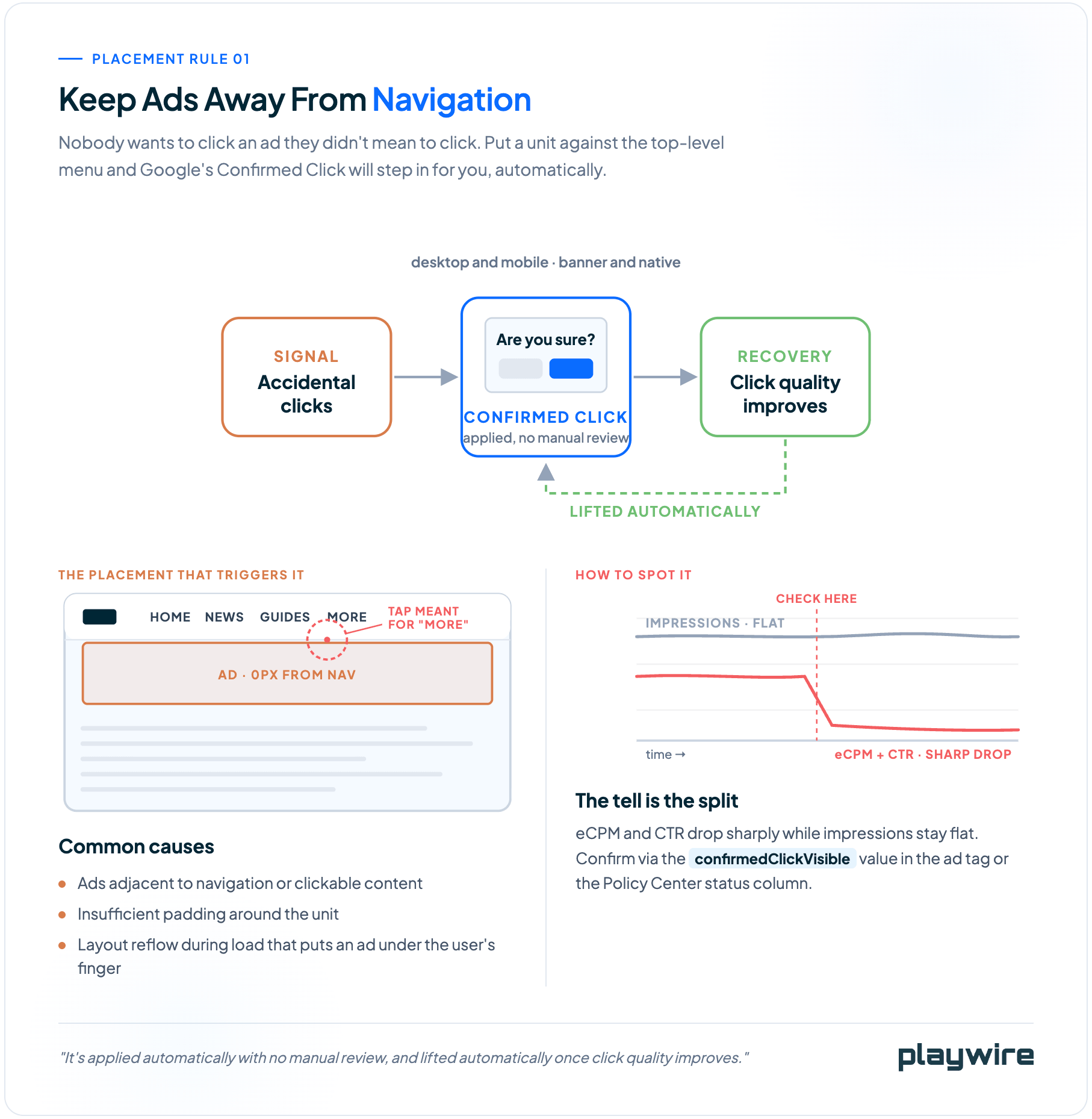
The consequence isn't just annoyance. Confirmed Click is a Google feature that adds an "are you sure" interstitial to placements showing signs of generating accidental clicks. It's applied automatically with no manual review, and lifted automatically once click quality improves.
Common causes are ads adjacent to navigation or clickable content, insufficient padding, and layout reflow during page load that puts an ad under the user's finger.
Google's 2025 policy update made enforcement reporting more granular at the banner level and extended it to native ads. Confirmed Click applies on desktop as well as mobile.
Pad Generously
Padding between ads and content does two jobs: it reduces accidental clicks and it makes the ad legible as an ad. If a user has to wonder whether they're looking at an ad, you have a problem.
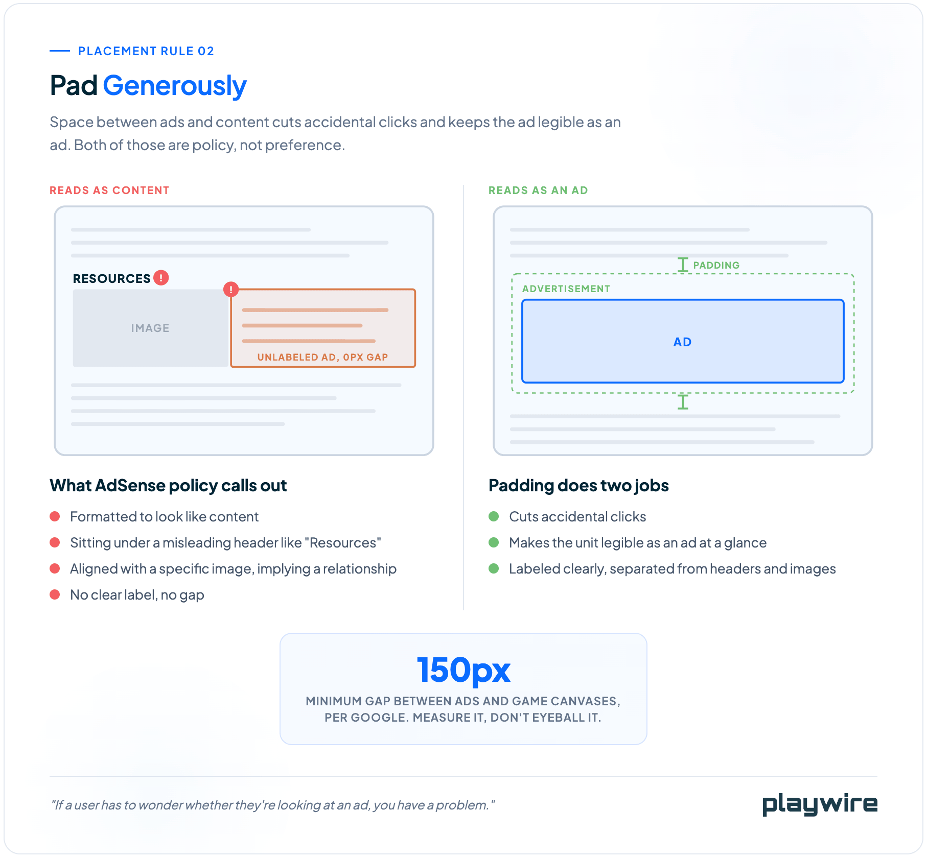
AdSense placement policies are specific about this. Ads must not be formatted to look like content, must not sit under misleading headers like "Resources," should be labeled clearly, and shouldn't align with specific images in a way that implies a relationship.
For gaming sites, Google recommends at least 150px between ads and game canvases. That's a hard number worth measuring rather than eyeballing.
Place In-Content Units on a Rhythm
In-content units work best when they follow the reading flow rather than interrupting it arbitrarily. Our published guidance is to place the first in-content unit after the third or fourth paragraph, then repeat every two to three paragraphs.
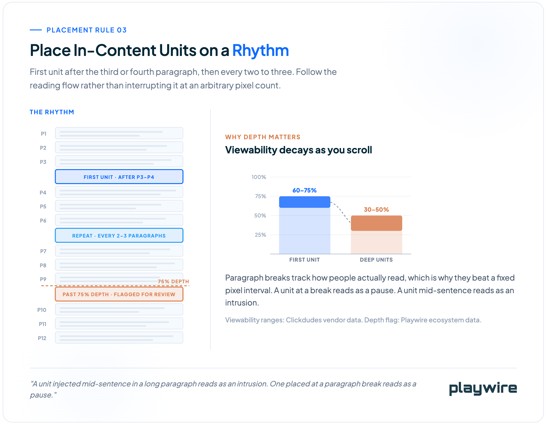
Paragraph structure tracks how users consume the page, which is why this beats a fixed pixel interval. A unit injected mid-sentence in a long paragraph reads as an intrusion. One placed at a paragraph break reads as a pause.
In-content viewability decays with depth. Vendor data from Clickdudes puts the first in-content unit around 60% to 75% and deep units at 30% to 50%. Our own ecosystem data flags any unit placed past 75% page depth for review.
Reserve Slot Space
Ads that load or resize dynamically cause layout instability, which hurts Cumulative Layout Shift and, through it, your search performance. Google's web.dev guidance is to reserve space for ad slots and standardize slot sizes to prevent reflow.
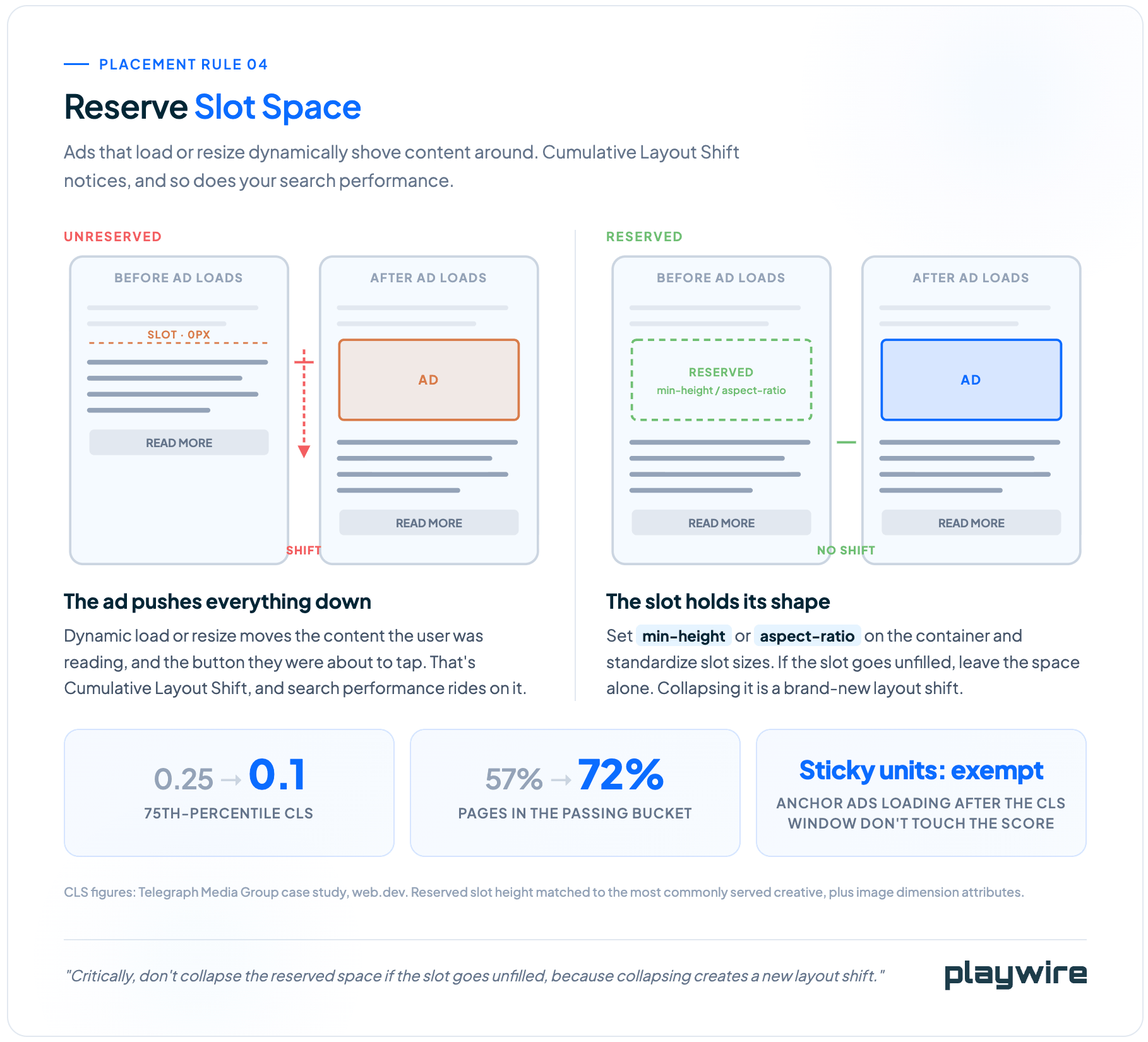
Use min-height or aspect-ratio CSS on ad containers. Critically, don't collapse the reserved space if the slot goes unfilled, because collapsing creates a new layout shift.
The Telegraph Media Group case study is the useful benchmark here. Matching reserved ad slot height to the most commonly served creative height, plus adding image dimension attributes, improved 75th-percentile CLS from 0.25 to 0.1 and raised the passing bucket from 57% to 72%.
Sticky ads that load after the CLS measurement window don't affect the CLS score, which is one more argument for the anchor unit.
Unit Mix: Fewer, Better Units
The most effective way to increase revenue without increasing density is shifting your mix toward formats that earn more per impression. This is the lever most publishers under-use, because adding units feels easier than upgrading them.
Standard display units are the workhorses. The IAB calls 728x90, 300x250, and 160x600 standard for a reason: they work in most contexts and rarely limit a buyer's creative. They're also commodity inventory that every publisher runs, and buyers price them accordingly.
High-impact formats change the math. Skins, expandable leaderboards, in-content video, and rewarded video command higher CPMs because they deliver better engagement to advertisers.
Where Each Format Earns Its Slot
Our own ecosystem data flags any publisher running three or more filled units with zero high-impact formats. That's a thin mix, and it usually means the layout is leaving CPM on the table.
- Anchor and adhesive units: a single bottom rail that follows the user and refreshes on an interval generates more revenue per viewport than several static display units scattered through content.
- Rails: simple units that occupy a highly visible place in the viewport. Nothing fancy, but the ecosystem data puts the family at 71% weighted viewability.
- Corner video: captures video CPMs without requiring you to produce video content, and it's the most device-neutral unit in our data.
- Interactive and rewarded formats: the more interactive the creative, the more advertisers pay. Chess.com tested rewarded video in a web environment and saw 4x higher CPMs compared to traditional video units.
Size Selection
Standard IAB sizes give you universal compatibility, and that should be your foundation. Plentiful standard inventory plus a few high-impact units competing for the same slots beats either approach alone.
If you can accommodate a 970x250 billboard, you've created a valuable piece of inventory that large buyers specifically look for. It also benefits from the 30%-of-pixels viewability threshold that applies to large display ads.
Historical data on size viewability exists but should be treated as a baseline rather than a current benchmark. Google's 2014 study found the most viewable size was 120x240 at 55.6% and the least viewable was 300x250 at 41.0%. Moat's Q3 2014 data put desktop 970x250 highest at 65.8% in-view, with 320x50 leading mobile at 64.6%.
Those studies are more than a decade old. Blockthrough makes the sensible point that publishers should generate their own measurement data rather than relying on aging industry averages.
Refresh Without Wrecking Your Viewability
Ad refresh multiplies impressions from the same placement, which makes it tempting and dangerous in equal measure. Done badly, it inflates impression counts while destroying the viewability number that prices all of them.
Google Ad Manager permits refresh, but publishers must declare which inventory refreshes, the trigger type, and the minimum interval through Inventory Rules and Publisher Declarations. Not declaring is a policy violation.
Your declared minimum interval must be at or below your actual interval. Refreshing at 220 seconds gets declared as 180, not 240. Google also states plainly that longer refresh intervals make inventory more desirable to buyers.
| Refresh consideration | What applies |
|---|---|
| Trigger types | User action, event-driven content change, time-based |
| Declaration intervals available | 30, 60, 90, 120, 180, 240, 360 seconds |
| Mobile app fixed refresh range | 30 to 120 seconds |
| AdSense auto-refresh | Not permitted; user-initiated refresh counts as a normal impression |
Demand-side treatment varies. Some DSPs and SSPs discount or opt out of refreshed inventory, and partners generally prefer refresh tied to viewability thresholds and engagement checks. Test refresh on a section of your site against a control before rolling it out site-wide.
Choosing Your Density Posture
We break placement strategy into three postures. None is correct in the abstract. The right one depends on your audience, content, and how much you're willing to trade session count for session value.
| Posture | Approach | Typical layout |
|---|---|---|
| Conservative | User experience paramount, minimal ad interference | Bottom rail + in-article |
| Moderate | Balanced consumption with moderate ad exposure | Bottom rail + in-article + medium rectangle |
| Standard | Content fully accessible, ads present throughout the journey | Bottom rail + in-article + sticky rail + video |
Notice that the bottom rail appears in all three. That's consistent with the ecosystem data putting it at the top of the earnings table.
.png?width=1816&height=1504&name=playwire-density-posture-graphic-html-09-15-2026_01_37_PM%20(1).png)
Run that math with your actual RPS and session numbers rather than your instincts.
Jumping straight to the standard posture can look great for a month. Then bounce rate climbs, pages per session falls, and you've traded a durable audience for a temporary revenue bump.
Testing: Every Recommendation Is a Hypothesis
Nothing in this guide is a rule you should apply blind. These are starting points that have held across a specific sample of publishers, and your site is not that sample.
A set-and-forget approach to layout will always underperform a testing-driven one. The publishers who consistently generate the highest session RPS are the ones running ongoing experiments.
What's Worth Testing
Layout testing has a wide surface area, so prioritize by expected impact rather than ease of implementation.
- Placement positioning: moving a single unit up or down relative to the fold, nav, and content.
- Unit format substitution: swapping a standard display unit for a high-impact or video format in the same slot.
- Density variation: adding or removing a unit and measuring session-level revenue, not just the unit's own earnings.
- Refresh intervals: testing against a control on a subsection before any site-wide rollout.
- Device-specific layouts: particularly if your device mix sits at either extreme of the bimodal split.
- Content-type variations: long-form articles, listing pages, and tool pages should not share a layout.
How to Run the Test
Test one variable at a time with proper traffic splitting. Changing multiple elements simultaneously produces data you can't interpret, and you'll spend the next quarter arguing about which change caused what.
Run tests long enough to account for daily and weekly variation. A three-day test on a site with strong weekday-weekend patterns measures the calendar, not your layout.
Google frames viewability optimization as an iterative redesign process rather than a one-time fix. That's the right mental model. Your layout is never finished.
A Layout Audit You Can Run This Week
If you want a concrete starting sequence, work through these in order. Each one is a specific report to pull or a specific number to check.
- Pull site-wide Active View viewability: if it's below 70%, that's your headline problem, and the step function says fixing it is worth roughly double the CPM.
- Split anchor unit viewability by device: desktop anchors below 70% are the highest-value fix available to most publishers.
- Identify your top three formats by revenue: if they're not roughly 90% of your total, your effort is spread too thin.
- Measure mobile ad density on your top three templates: sum ad heights in the main content area, divide by main content height, confirm it's under 30%.
- Find your lowest-viewability unit with meaningful volume: decide whether to move it, resize it, or remove it. A stinker placement costs you more than it earns.
- Check device targeting for mismatches: mobile leaderboard serving on desktop and similar errors are silent and expensive.
- Audit slot space reservation: confirm containers use
min-heightoraspect-ratioand don't collapse on unfilled slots. - Verify refresh declarations: trigger type and minimum interval declared correctly in Ad Manager, and timers gated on in-view status.
Work top to bottom. The first two items cover the changes most likely to move your revenue number in the next 30 days.
Frequently Asked Questions
These are the questions publishers ask us most when they're trying to fix a layout instead of just running the one they inherited.
Where should I place ads on my website for the best performance?
Anchor or sticky units, such as a bottom rail, consistently earn the most and hold the highest viewability because they stay in the user's view as they scroll. In-content units placed after the third or fourth paragraph and repeated every two to three paragraphs are the next most reliable placement. Placements near top navigation or at the very top of the page tend to underperform because users scroll past them before they register.
What's the best ad size for sidebar, in-content, and mobile placements?
Standard IAB sizes remain the safest foundation: 728x90 and 970x250 for leaderboards, 300x250 for medium rectangles, and 160x600 for skyscrapers. Sidebar rails on desktop commonly run 120x600 to 300x600. Mobile placements typically use 320x50 or 320x100 for anchor units, since larger IAB sizes don't fit smaller viewports without adding density.
How many ads is too many on a page?
The Coalition for Better Ads sets a firm mobile ceiling of 30% ad density, and Chrome filters ads on pages that exceed it, which can effectively zero out mobile revenue on that page. Desktop had no defined limit until 2025, when the Coalition added a 50% density ceiling and a stricter 30% threshold when a sticky video ad is present. Beyond compliance, more units per page do not reliably raise revenue once you separate layout density from session depth.
What's the difference between above-the-fold and below-the-fold ad placement?
Above-the-fold means the ad is visible without scrolling; below-the-fold means the user has to scroll to see it. Viewability doesn't automatically favor either: Google reports that 47% of display ads are viewable below the fold, and the most viewable position overall is right above the fold rather than at the very top of the page.
Does ad placement affect SEO or page speed?
Yes. Ads that load or resize dynamically without reserved space cause layout shift, which hurts Cumulative Layout Shift, a Core Web Vitals metric that factors into search ranking. Reserving slot space with min-height or aspect-ratio CSS and never collapsing unfilled slots prevents this. Lazy loading and asynchronous ad loading also protect page speed metrics like Largest Contentful Paint.
What ad layout works best for blogs, news sites, or mobile-first publishers?
Blogs and content-heavy sites generally perform best with a bottom rail plus repeating in-content units, since that combination carries roughly 90% of revenue for a typical publisher in our data. Mobile-first publishers should prioritize anchor units, since bottom rail viewability on mobile runs a median of about 93% against 76% on desktop for the same unit. News sites with high pageview depth benefit from testing density per content type rather than applying one layout site-wide.
How We Approach Layout for Publishers
We're not going to replicate the layout you brought with you from another provider. Publishers come to us to make more money from their ads, and asking us to keep the layout that wasn't making that money is an opposing priority.
Our approach to layout is built on a specific premise: ads should work with the content experience rather than interrupt it. The RAMP platform includes dynamic ad injection that adjusts placement based on content type, device, scroll behavior, and user context.
A 3,000-word feature and a 500-word news brief should not carry the same layout. Static layouts over-serve ads on short content and under-serve them on long content, and you lose on both ends.
Our units are aware of each other and of page context. They make decisions about what to do based on what else is already rendering on the page, which produces a better page-level experience and higher topline revenue than a set of independent units ever will.
Publishers who've made the move have the numbers to show for it. Recurrent tested four monetization providers on page speed and revenue and measured 500ms+ faster page speed and 17% higher revenue with us. SparkNotes saw an 87% RPM increase with high-impact units like site skins across a six-year partnership.
If your site-wide viewability is stuck in the 50s, your anchor is underperforming on desktop, or your top three formats aren't carrying 90% of your revenue, those are solvable problems with measurable outcomes attached. Apply now and we'll start with your numbers rather than a template.