


November 7, 2023
Editorial Policy
All of our content is generated by subject matter experts with years of ad tech experience and structured by writers and educators for ease of use and digestibility. Learn more about our rigorous interview, content production and review process here.

Key Points
- Blog Layouts = Garden Vibes: Just as you wouldn't put a gnome on top of your best blooms, your ad layout needs to enhance, not overshadow, your content. It's about striking that aesthetic balance!
- Content-First Approach: Think of your blog as prime real estate; selecting the right ad placement is crucial. Not every square inch needs a 'For Sale' sign!
- One Size Doesn't Fit All: Whether you're a conservative, moderate, or aggressive player in the ad game, finding the perfect blend of monetization strategies for your specific blog is key. Remember, it's a dynamic dance between user experience and revenue generation.
- Device Dilemmas: When it comes to mobile vs. desktop experiences, both have their quirks. Whether it's the compact real estate challenges of a mobile device or combatting ad blindness on desktop, tailoring your strategy for each blogging platform is a must.
You’ve got the audience; now it’s time to monetize your blog content.
When it comes to effective blog monetization, ad layout matters. Sticking with our garden metaphor, imagine your blog as a well-tended garden. In this green digital paradise, the flowers and plants (your premium content) are the stars of the show.
So, you’ve built this beautiful lush garden that everyone in town is stopping to see, now is the perfect time to enhance it with a few decorative pieces like fountains or gnomes (ads).
But, remember who the star of the show is. A gnome next to a garden path? That’s an enhancement. A gnome on top of your tallest flowers, though? Now you're overshadowing the natural beauty of your garden. Just like in your garden, when it comes to building an ad strategy, developing the right ad layout is paramount.
Don’t worry, though; Playwire is here to help you strike that perfect balance. Let’s dig up the best ad layouts for blogs and plant the seeds of your monetization success.

Read the Complete Guide to Monetizing a Blog
The Best Layouts for Content Heavy Sites
When it comes time to monetize a blog, ads are usually a go-to strategy. In fact, Google AdSense is the most popular monetization method for bloggers, followed by affiliate marketing.
To make sense of monetizing your blog with ads, understanding effective layouts is a good first step.
The right layout will accomplish a few essential tasks:
- Enhance the user experience
- Maintain aesthetic integrity
- Ensure multi-device responsiveness (mobile vs. desktop)
- Maintain quick page load speed
- Build trust with your audience
Balancing ad placement with user experience is critical for digital entrepreneurs. Overloading the page with ads is a recipe for unhappy readers and a drop in the number of sessions. However, by the same token, slowly monetizing and being too protective of your content, and now you're leaving revenue on the table.
Proper page layout ensures this equilibrium between user experience and ad placement, marrying the art of content creation with the science of monetization.
To better understand this, let’s explore your blog’s current layout (without ads) and which specific ad layouts will typically ensure monetization success based on that layout.
Listing Pages
Let’s start our layout journey with listing pages.
There are three common layouts for listing pages:
- Tiled listings
- Single-column listings
- Single-column listing with a sidebar
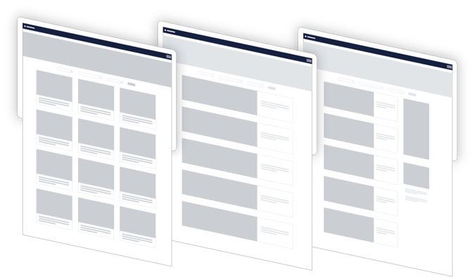
When it comes to choosing which ad units and layouts to go with, understanding your comfort level with ad density is important. The right balance will be different for each site.
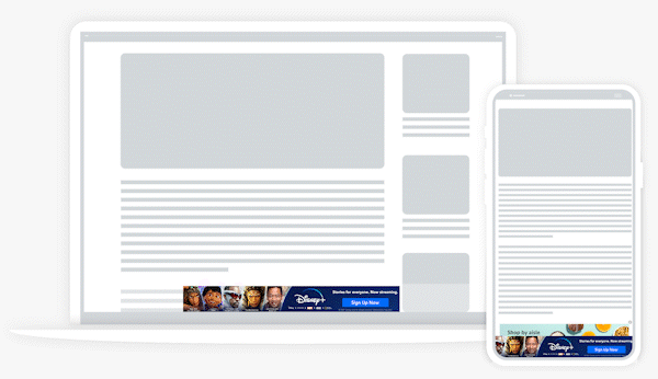
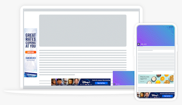
If you’re looking for a safer approach, adding a bottom rail and an in-content unit that repeats every few rows is a good strategy. You might also consider a flex leaderboard. If you’re leaning towards a more aggressive strategy, you might employ the use of a sticky medium rectangle or even a flex skin.
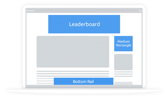
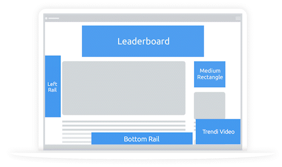
Article Pages
These content-heavy pages are your bread and butter, so careful attention to placement and density is critical. You can either opt for content on the left with an open sidebar area or go for full-width article content.
Regardless of your choice, here are a few ad unit recommendations for article pages. While you’ll see some common ad units, like bottom rail ad units, here are a few others to consider:
- In-Content: A popular choice for web display ads, these units are best placed after the third or fourth paragraphs and repeat every two to three paragraphs after that.
.gif?width=550&height=326&name=Desktop-Bottom-Rail-In-Article-White-BG%20(1).gif)
- Relevant Article: Going for a more moderate strategy? This ad unit lists the most recent articles from your RSS shown with an ad.
- Video: For a slightly more aggressive approach, consider a high-yield video ad unit. Video ads offer a ton of placement variety, and are great for visibility and generating higher RPMs.
Aggressive, Conservative, or Moderate?
Building the appropriate ad layout strategy for your blog requires an understanding of your audience and content.
With the value of the creator economy valued at around $76 billion in 2022, it’s easy to want a piece of the digital pie. However, moving too quickly with monetization can end up hurting your site instead of helping it.
Jumping into aggressive ad placement can seem fruitful from a short-term ad revenue perspective, but you need to think deeply about the user experience. The last thing you want to do is alienate the audience you’ve spent so much time building by bombarding them with too many ads, too quickly.
At Playwire, we break down ad placement strategies into three categories:
- Conservative: User experience is paramount with this strategy, opting for clean and accessible content with minimal ad interference.
- Moderate: This balanced approach allows readers to comfortably consume content while being exposed to a moderate amount of ads.
- Aggressive: While content is still entirely accessible, the user is prompted with ads throughout the duration of their journey on the page.
Unfortunately, there’s no one-size-fits-all strategy here. What works best depends on your audience, content, and long-term goals.
Regardless of which approach you choose, it’s vital to constantly monitor key revenue metrics and adjust your digital advertising strategy accordingly. The goal is to find a harmonious blend between user experience and revenue generation.
Desktop Vs. Mobile Ad Experiences
Another key consideration for how to layout a blog for monetized ads is the difference between the mobile and desktop experience.
The Challenges of Mobile Ad Layouts
First, let’s start with mobile. As of 2023, around 58% of all website traffic comes from mobile devices. It’s such an important aspect of the user experience that every digital entrepreneur needs to grasp.
With smaller screens, there’s less real estate to work with. Ad units can easily distract and overshadow. There’s also a chance for accidental clicks, which can skew metrics and frustrate users.
You also have to consider internet speeds for mobile devices.
While we all wish our phones were as lightning-fast as our at-home computers, that’s almost never the case. As such, heavy ad use can slow down page loading times and lead to higher bounce rates. Thus, ad placement and density for the mobile experience needs to be extremely methodical.
-- Article Continues Below --

Browse our full library of resources on blog monetization
The Challenges of Desktop Ad Layouts
Next up is the desktop experience. Here, you have some additional obstacles to overcome:
- Ad Blindness: Over time, users can subconsciously ignore standard ad units, such as banner ads, resulting in lower click-through rates for those units.
- Screen Diversity: With wider screens and varying resolutions compared to mobile devices, finding relevant ads that look good on all screen types can present its own challenge.
- Multitasking: When on a desktop, many users typically have multiple tabs open. If an ad doesn't pop up and immediately capture their attention, users may not see it at all.
While both platforms offer great opportunities for blog monetization, ad placement, selection of ad unit types, and ad layout are still critical factors — and they vary greatly between mobile and desktop.
Master Your Strategy with Playwire
So, that’s your crash course on how to layout a blog for monetized ads. Regardless of vertical, digital entrepreneurs need to find a layout that balances the user experience with revenue generation. Ad layouts for blogs can be quite diverse and hinge on a creator's comfort level with ad density and ad space.
The good news is, you don’t have to go it alone. Here at Playwire, our standard layouts adjust where relevant ads are placed based on individual users and how they behave on a site. We automatically balance the user experience with ad placement in a dynamic way so you can spend less time worrying about placement and more time crafting your killer blog content.
We’ll offer the tools and expertise; you provide the quality content. Then you can sit back, and watch your ad revenue explode (while we stay on top of monitoring every minute of your blog’s performance).
Want to learn more about Playwire and our suite of ad tech tools for creators like you? Get in touch with the team today.
