


April 24, 2024
Editorial Policy
All of our content is generated by subject matter experts with years of ad tech experience and structured by writers and educators for ease of use and digestibility. Learn more about our rigorous interview, content production and review process here.

Key Points
- User frustrations with ads on recipe sites and food blogging sites have reached an all-time high, growing over the last few years as monetization solutions have pushed the boundaries of ad clutter.
- Creators of recipe sites and food blogging sites feel they have little choice about the ad experience they can create for their audience.
- A happy medium is possible! This article outlines key guidance on the layout of your site to help find a happy medium between user experience and ad revenue.
The Pains of the Recipe Site Experience
Let me start by breaking down my personal history and usage of recipe sites. I’m what you might call a “flexible chef.”
I love getting inspiration from a new hopefully tasty recipe and then adding my own twist. I also tend to decide what to make on the fly depending on what kind of produce looks good on the shelves of the grocery store on a particular day.
This style of cooking tends to have me lean way more in the direction of online recipes than a traditional recipe book. I can pop onto my phone in the store, quickly search by ingredient, and find several recipes with just a few clicks. It’s easy to see, I’ve been a huge consumer of online recipes for years.
Let me just say the thing most people don’t want to say, but you probably already know: recipe sites have gotten really, really annoying in the last few years. There are two main culprits for the feelings most people now have about recipe sites:
- The deluge of words and backstory to win the approval of the SEO gods makes it difficult to find the actual recipe in all the noise.
- Ads. Over the last few years, the introduction of monetization solutions on the recipe or food blogger scene has significantly altered the approach these sites have taken to ads.
The good news is while there’s a reason we ended up here, there’s a very clear and easy approach to remedy both of these problems. Keep reading for the inside scoop!

Read the Complete Guide to Monetizing a Blog
Improving Recipe Blog Structure
The easiest place to begin to figure out how to improve something that isn’t working is to review how you ended up with that thing in the first place. There are plenty of clues for how to improve by understanding why decisions were made in the first place.
Let’s investigate the most common recipe blog structure we have today, and how and why we ended up here:
- Title/Picture
- A “Jump to Recipe” button (hopefully!)
- Potentially lots and lots of words
- Recipe:
- Details (e.g. cook time, prep time, number of servings, etc.)
- Description
- Ingredients
- Instructions
- Potentially a ton more words
The reason why this structure has evolved can be traced back to the origins of online recipes, which is blogging.
- Blogging hits the scene: Longform articles became all the rage with the advent of blogging. At some point, food blogging became incredibly popular, and the dawn of “online recipes” began. Because of their start in blogging, the structure of these recipes often follows the traditional “editorial” style food content with just a single column of long-scrolling content as the delivery method.
- SEO tricks evolve: As organic search evolved, so did the tactics to please the SEO algorithms. At some point along that journey, long-form content won favor, thus making it highly impactful to jam-pack articles full of as many words as possible, which, when combined with the rich history of storytelling in blogging, led to very lengthy articles packed around the recipes themselves.
- User frustrations emerge: As recipe articles started getting longer and longer, user frustrations began to surface, leaving people feeling like finding the actual recipe was like looking for a needle in a haystack.
- Small UX additions hit the scene: Due to these frustrations, website administrators began to introduce small UX tweaks to help make it easier for users to find the important parts of the article, like the “Jump to Recipe” button.
While these small changes are great, they are ultimately band-aids on top of a fundamental experience that is geared towards an editorial mindset.
At their foundation, recipe sites are built off of experiences originally meant to serve an audience that wanted to “read an article” rather than “follow a recipe.”
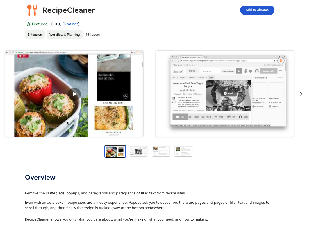
This problem is so common that there is a fully built Chrome extension that just hides all the “extra stuff” and ads in recipe sites:
The true fix lies in changing the fundamental experience underlying the site, rather than trying to put band-aids on an experience built for something else.
Our Recommendation: We’d recommend taking inspiration from another corner of the web rather than traditional editorial content. We’ve taken a look at what sites built for tools, calculators, games, and more have done to make a truly purpose-built experience that takes into account what the user needs the site to do, rather than simply putting words on a page.
This means thinking independently about the experience a user should have on both desktop and mobile (and what the visitor might be doing on each device).
Recommended Mobile Experience
Let’s start by looking at mobile, given that is likely where the higher percentage of users will be when interacting with a recipe site or food blog. The important factors to consider when thinking about the experience can be easily raised when considering what users will be doing on their devices.
Users may be:
- Quickly searching and finding recipes based on a specific ingredient
- Referencing the ingredient list when shopping in-store
- Leaving the recipe open on their mobile device while working in the kitchen and referencing the instructions or steps as they cook
- Checking recipe details as they meal plan (e.g. how long the meal will take to make)
You’ll notice what is absent from this list, which is:
- Reading a story about the recipe
- Digging super deeply into health benefits
- Looking at many pictures of the process of cooking or intermediary steps
That doesn’t mean that the second list of items is not important or irrelevant, but it does mean that we should make sure the mobile experience prioritizes the common use cases and doesn’t let the uncommon use cases interfere with the experience.
As a result, we recommend an experience like the one shown in the graphic below.
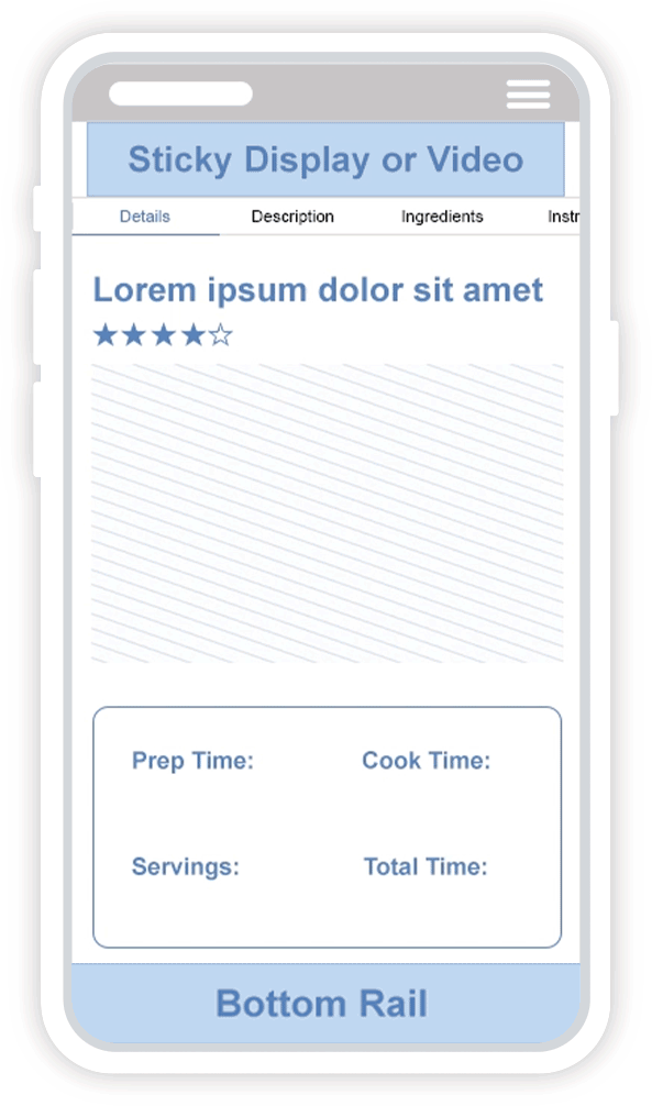
Order of Recipe Content: We recommend putting the most important items for the experience at the top. Instead of burying them deep within the page and giving a jump link, put the important stuff right at the top. Lead out of the gate with:
- Details (e.g. cook time, prep time, number of servings, etc.)
- Ingredients
- Instructions (and make sure you make a short version of your instructions that doesn’t include too much editorial content and storytelling)
- Everything else can be layered in after that
Easy to Find: The suggested navigation menu makes the important things a user would want to do (the first list referenced above) easy to find and easy to get to. It goes far deeper than just giving a recipe jump link. Rather, it gives users a quick and easy way to navigate to the specific item they are looking for in each particular case:
- I’m in the store shopping, I can jump right to the ingredient list.
- I’m in the kitchen cooking, so I can jump right to the recipe instructions.
- I’m meal planning for the week, I can jump right to the details to understand cook time, prep time, etc.
The beauty of adjusting your experience this way means you can still get all of the SEO juice out of longer articles and still provide the fun, expository storytelling that your readers love, without hurting the experience for any one particular type of use case!
-- Article Continues Below --

Browse our full library of resources on blog monetization
Recommended Desktop and Tablet Experience
Let’s talk about the desktop experience. For most recipe blog posts, you’ll have less desktop traffic than mobile traffic. However, because of the screen real estate you have on desktop, it can still be a pretty heavy hitter when it comes to ad revenue generation.
It’s also important to note when it comes to your desktop experience, it’s likely the one that is getting reviewed upstream by demand partners like SSPs and DSPs when they are trying to evaluate if you have ad clutter or deciding if they should label you as Made for Advertising (MFA).
So, making sure your desktop experience is buttoned up is incredibly important, even if it isn’t driving the majority of your traffic, because it can still land you on an exclusion list (which would also affect your mobile revenue generation ability).
We’ll approach this experience the same way, by thinking about what most people will be doing when reviewing your site from a desktop device.
They’ll likely be:
- Browsing original recipes, and thinking about what to make (so beautiful food photography at the top of the screen will be an important win!).
- Reading more about health benefits (which is also a fabulous way to get found for search as users often search for paleo meals, vegan recipes, or other health focuses).
- Cooking in the kitchen. Many users opt for a desktop experience when looking at a recipe while cooking.
To support the user’s ability to still quickly find the portion of the recipe or article that they want, we’d recommend an experience similar to the one shown in the following graphic.
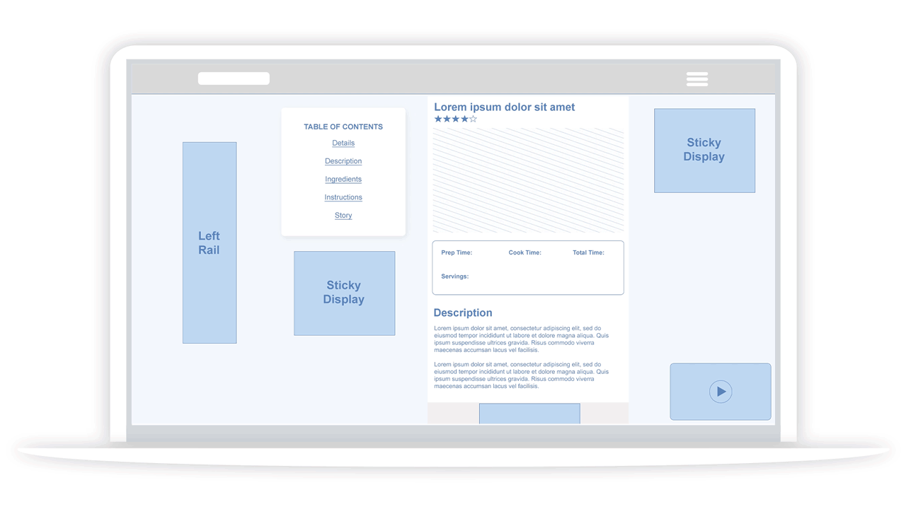
What you’ll notice about this experience is that it balances your ad revenue goals with user experience in a decidedly sophisticated way.
The Table of Contents that stays sticky allows the user to easily access the sections of the recipe they need, no matter how far down the page they are at the moment. This means the user is in control of quickly and easily finding what they want instead of needing to hunt around for it.
This recommended experience also makes strong use of adhesive ads and builds the experience around creating in-view opportunities that are unobtrusive, which is something that we’ve learned in our extensive experience in monetizing games, tools, and calculators.
The other great thing about this experience is that it tailors itself to the screen size the user is on. The rail units on either side of the page only serve on screens large enough to make it uncluttered. The sticky ad below the Table of Contents stays in view at all times, something that makes advertisers very happy (and willing to spend lots of money!), but it keeps itself out of the way of the user, meaning that users won’t mind it in the least.
The experience also allows for flexibility to add in-content ads as is feasible for your content structure or desired experience. This is an approach that gives you more choice and flexibility while still maximizing revenue opportunities.
Improving Recipe Blog Ad Experiences
The proliferation of “cookie cutter” ad experiences provided by monetization or ad management solutions on recipe sites has seriously deteriorated the user experience.
How Creators Interface with Ad Management Solutions
Something that we have heard countless times from content creators is that they’ve chosen to work with monetization providers because they can provide technical know-how, alleviating the need to build out a massive technical and ad ops team.
Unfortunately, another common concern we hear from creators who come to us from other monetization providers is that they feel like they have little choice over the ad experience on their website.
Essentially these providers have taken advantage of the fact that creators may not be in a position to build out a technical team, to force a specific ad experience on them. And many creators have felt somewhat powerless (or may feel they lack the knowledge) to fight back.
How Ad Management Solutions Have Hurt User Experience
This issue has led to an all-too-familiar experience for the users of recipe websites. As an avid user of recipe sites myself, I can tell you first-hand about my experience with them. The experience falls into at least one of two categories of problems:
- The Cookie Cutter Problem: Your website looks just like everyone else’s.
- The Ad Overload Problem: Your website is so overloaded with ads it begins severely impacting user experience.
The Cookie Cutter Problem
In the first instance, you’ve likely gone with a monetization provider that has a single-templated ad experience, at which point you have no flexibility and start to look just like everyone else.
This may be ok with you, or it may not. Chances are, you want more of a say over how your experience looks and feels.
This probably means you are also sacrificing opportunities to do something truly unique that integrates seamlessly into your unique website or user experience.
Truth is, you’re probably missing out on opportunities to implement cool, custom, high-impact (and not to mention very lucrative) experiences like the example below.

The Ad Overload Problem
In the second instance, you’ve probably noticed that you aren’t loving the experience you’re giving your users. You may even see a decline in user engagement metrics and losses in your site or blog traffic.
This is the problem that really starts to make noise in your user base, bubbling up to the kinds of comments you hear made about recipe sites as an entire category.
Heck, just a quick Google search of “recipe site ads” reveals plenty of discussion forums about just this frustration:
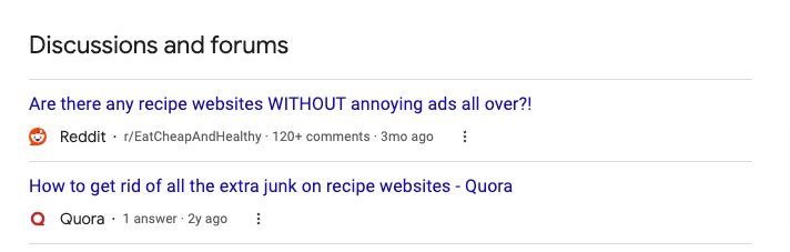
Here are some of the hallmarks of this experience that users are especially vocal about:
- Ads causing the page to reload frequently: I see this one regularly when I’m using my phone to follow a recipe while cooking. I’ll do all the work to scroll myself to the right part of the page to read the recipe and the ads will start to weigh the page down so much that it forces the page to reload, scrolling me back up to the top of the page.
- Ads in the way of content: Generally, users get frustrated when the viewport on their screen at a given time is taken up by more ads than your quality content, something that is rampant on recipe sites these days.
- Ads that move content around: Again, a user scrolls to the instructions part of the recipe, hoping to follow it while cooking. Display ads may load in and out of the page and take up different screen real estate, causing the food content to shift up and down every time a different ad loads. This means lots of re-scrolling (usually with messy food-covered hands) to try and get the appropriate part of the recipe back on your screen.
Recipe site users widely discuss the frustrations caused by this experience and have even introduced a category of “hacks” to get around them. My favorite hack: many users screenshot the portion of the recipe they want and then exit the site completely, just using the picture they’ve taken to follow the recipe instead.
That means ZERO ad revenue dollars for that visitor at the end of the day, all because you made it so hard for them to use your site.
The ad overload problem happened as a way to try and get more revenue out of each user, but in the end, it’s likely costing you more than you realize by pushing users away.
How to Remedy the Problem
The good news is that it is possible to find a perfect middle ground to satisfy your user base and still make you more ad revenue.
Metrics to Watch
The first step: make sure you are focusing on the right metrics. Many creators focus on RPM, a measure of revenue per page. While this is a very important metric, and you should be looking at it, you should really put more focus on RPS (Revenue per Session).
RPS is a measure of how much revenue you can earn on each user session. This helps take into account major changes in your ad layout that hurt user engagement and start to eat into revenue by cutting user sessions short. RPM can gloss over those kinds of changes.
Layout
Test layouts to find the best intersection between your improving revenue and user experience metrics (like engagement time, pages per session, etc.).
Follow the layout recommendations outlined in the Improving Recipe Blog Structure section for some great starting points.
Education
Another very important factor will be in choosing a partner who is willing to educate you about their recommendations and make those custom recommendations for your unique site and user experience.
The majority of your ad layout can be relatively standard in most cases, but there are real gems hidden in understanding user behavior that are unique to your site. Knowing where users tend to stop and stay on a particular page can create huge opportunities for ad placements that are more impactful without being overly intrusive.
Working with a partner willing to look at your site, give you the best foundation, make recommendations specific to your experience for little nuggets of additional wins, and explain to you why these recommendations make sense is key.
Incorporating High Impact Units
The problem with the cookie-cutter approach is that there’s no room for cool, high-impact activations. This means brands don’t have a lot of incentive to buy ads on your site instead of someone else’s.
A partner who can offer you high-impact activations (like flex skins, for instance), backed by a team of direct sellers with quality brand relationships and experience making premium brand deals, can drive an entirely new revenue stream and offer visitors what they actually want to see.
Bringing Creators the Power of Choice
Time and time again, I’ve watched creators feel powerless. I’ve watched them feel bullied.
Everything we are building here at Playwire is meant to help empower creators with the power of choice. We start by providing you with the best foundation and then layer in customization where it makes sense for your specific site.
And best of all, we offer you choices every step of the way. Our job is to educate you on the tradeoffs of one decision versus the other and provide you with our expert recommendations, but allow you to make the final choice.
Because after all, it is your business. You should get to decide what’s right for you. End of story.
